Best Practices
This article details the best ways of using Recommendations to increase your conversion rate, basket size and order value significantly. They are based on our 10+ years of eCommerce experience, across thousands of stores.
Logics #
Recommendations come bundled with 20+ logics that lets you convert visitors from any page of the webshop. This is the setup we have seen work the best for most eCommerce stores.
You can browse the details on all our Logics here.

Home Page #
The Home Page is the front window into your store, so it should look interesting and dynamic. We often see the lowest direct performance from this page, but it still effectively introduces your catalogue to both new and returning visitors.
Banners should be shown in the order they are listed below, and ideally the first logic should be shown just below your top-banner. Following logics should be shown between other elements like categories, blog posts, instagram-feeds and so on.
Visitors Recommendations / Recommendations Based on Orders #
These banners excel at kickstarting the purchase flow and help visitors find something interesting fast. They show items tailored to the visitors browsing or existing purchase history to give them a fully personalised experience.
E.g. If they’ve already browsed LEGO trains, Visitor Recommendations will show other similar train packs. If a logged-in customer purchased strawberry flavoured protein powder several times, Clerk will prioritise this from other brands or product types.
If you can recognize a customer by their email, e.g. if they are logged in, use Recommendations Based on Orders. Otherwise, use Visitor Recommendations.
Impact: On average, webshops see an increase of 116% in avg. basket size and 8% in avg. order value for orders impacted by this banner.
Best Sellers #
Highlight your most popular items to kickstart the customer journey. We humans tend to follow the habits of others, so Best Sellers use social proof to give a quick overview of what others are buying on your site.
This banner often shows the same products over long periods of time, as you will naturally have a small selection of items that keep selling well.
Impact: On average, webshops see an increase of 84.4% in avg. basket size and 33% in avg. order value for orders impacted by this banner.
Hot Products #
Feature items that are currently in high demand, creating a sense of urgency and encouraging visitors to explore what’s trending. In contrast to Best Sellers, this banner updates frequently, as it reacts to product sales that change significantly in a short period of time.
Impact: On average, webshops see an increase of 47% in avg. basket size and 14% in avg. order value for orders impacted by this banner.
Newest Products #
Showcase the latest additions to your catalogue, keeping customers up-to-date on new releases. By clearly showing that your webshop is evolving, your increase the chance of more customers coming back organically.
Impact: On average, webshops see an increase of 42% in avg. basket size and 61% in avg. order value for orders impacted by this banner.
Category Page #
Here, customers are usually navigating towards a specific type of product, without necessarily knowing exactly which one they want.
Assist them in finding the right product by highlighting the best ones in each category.
Recommendations should be shown just below the category description and/or subcategories, so it’s the first thing visitors see when they start browsing categories.
Best Sellers / Hot Products in Category #
Present top-selling and in-demand items specific to each category, helping customers quickly identify popular choices within the category they’re exploring.
The best logics for you generally comes down to your type of business. As a rule of thumb, Hot Products work best for trend-based stores like fashion or sport Stores, where Bestsellers work well for stores with repurchasable products like supplements or foods.
Both logics provide a great way for your customers to find the right items quickly, which increases your conversion rate.
Impact: On average, webshops see an increase of 26% in avg. basket size and 31% in avg. order value for orders impacted by this banner.
Product Page #
This is often where customers arrive directly from search engines, so its crucial to make it easy to buy, and inspire them to continue into the site.
Clerk has two unique banners for this.
Best Alternative Products #
Provide options that are similar to the current product, catering to those who may want this tpye of tiem but with different features or price. It excels at increasing conversation rate by helping visitors find the right initial product to buy.
This should be the first banner shown on the product page.
Impact: On average, webshops see an increase of 41% in avg. basket size and 28% in avg. order value for orders impacted by this banner.
Best Cross-Sell Products #
Suggest products that complement the current product, encouraging customers to add additional items to their purchase. This excels at increasing avg. basket size, by clearly showing the best matching items they can buy with their initial product.
It can also lead to higher conversion rates, by showing visitors that they can get everything from one store, rather than having to buy from multiple different ones.
This should be the second banner shown on the product page.
Impact: On average, webshops see an increase of 50% in avg. basket size and 4% in avg. order value for orders impacted by this banner.
Add-To-Basket #
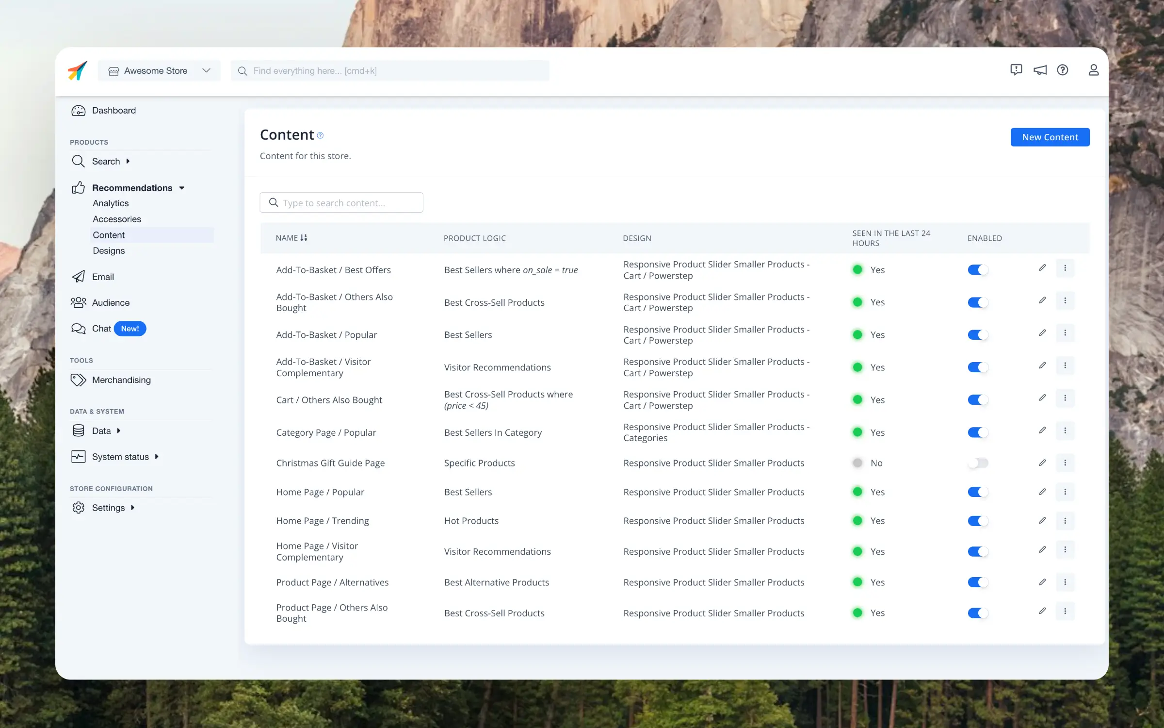
The Add-To-Basket, also called Powerstep, is a key place for increasing your avg. basket size.
When a customer adds a product to their cart, the powerstep should clearly confirm their action, provide a link to the cart, and present relevant products based on their interests. It can be implemented as a pop-up, sidecart or full page.
Ideally, each logic should be shown in the below order.
Best Cross Sell Products #
Present products that best complement the item just added to the basket. This is the most crucial banner as it is highly relevant to the product that a customer was interested enough in to add it to the cart.
Impact: On average, webshops see an increase of 39% in avg. basket size and 22% in avg. order value for orders impacted by this banner.
Visitor Recommendations / Recommendations Based on Orders #
Suggest items based on the visitor’s browsing or purchase history, increasing the relevance of recommendations.
As with the Homepage, use Visitor Recommendations for anonymous visitors, and Recommendations Based on Orders for known customers.
Impact: On average, webshops see an increase of 108% in avg. basket size and 36% in avg. order value for orders impacted by this banner.
Best Sellers #
Show items that most customers are buying on the webshop. This uses social proof to inspire other customers to buy something they might not have realised was available in your catalogue.
Impact: On average, webshops see an increase of 100% in avg. basket size and 52% in avg. order value for orders impacted by this banner.
Best Sellers on Sale #
If you have not been able to sell based on relevance in the first banners, you can try to sell based on discount in the last one. After all, most people like a good deal, even on their way out of a store.
Use the Best Sellers logic but with an added filter showing only products on sale.
Cart Page #
This is the final step where you have a chance to sell additional products before customers check out.
Most customers won’t add anything expensive here, so focus on cheaper products to increase the chance them finding something they want to buy before checking out.
Best Cross Sell Products #
Recommend affordable add-on items that customers are likely to add to their order before checkout.
This should be shown underneath the cart after the Checkout button, so its’ still easy to place the order.
Impact: On average, webshops see an increase of 91% in avg. basket size and 38% in avg. order value for orders impacted by this banner.
Blog Page #
Content pages like blogs, news, articles, and landing pages can help convert visitors into buyers. These pages often gain more SEO traction over time as they gather links, shares and traffic, so it’s important to keep them relevant with updated product recommendations.
Banners should ideally be placed somewhere relevant in the middle of the blog post, so visitors see them while reading. Alternatively they can be shown after the blog text.
Products Related to a Page #
Suggest products that are uniquely relevant and in stock for each blog post or article, guiding readers towards items that are related to the page they are reading.
Often, visitors will find your blog when they are looking for answers or solutions to problems, so being able to explain these solutions and tie them in with your products, is a fantastic recipe for extra conversions.
Categories Related to a Page #
Highlight product categories related to the content, making it easier for visitors to contine into your site to explore broader product ranges.
Customer Login Pages #
The customer login area is valuable for returning customers, especially in B2B. Place these logics prominently on the account dashboard to help customers quickly reorder their usual items:
Order History #
Use the logic Customer Order History to display a clear overview of previously ordered products, making it easy to reorder frequently purchased items. This is especially useful for B2B customers who often purchase the same products regularly.
Based on Orders #
Use Recommendations Based on Orders to show personalized product suggestions based on the customer’s purchase history. This logic helps customers discover new products that complement their previous purchases while staying relevant to their interests.
Streamline Designs #
Recommendations should fit snuggly into your existing webshop design, and it should be easy for visitors to find and interact with them.
Headlines #
Make sure that you use clear and descriptive headlines. for all your Recommendations. When visitors understand what they are seeing, they are much more likely to interact with Recommendations.
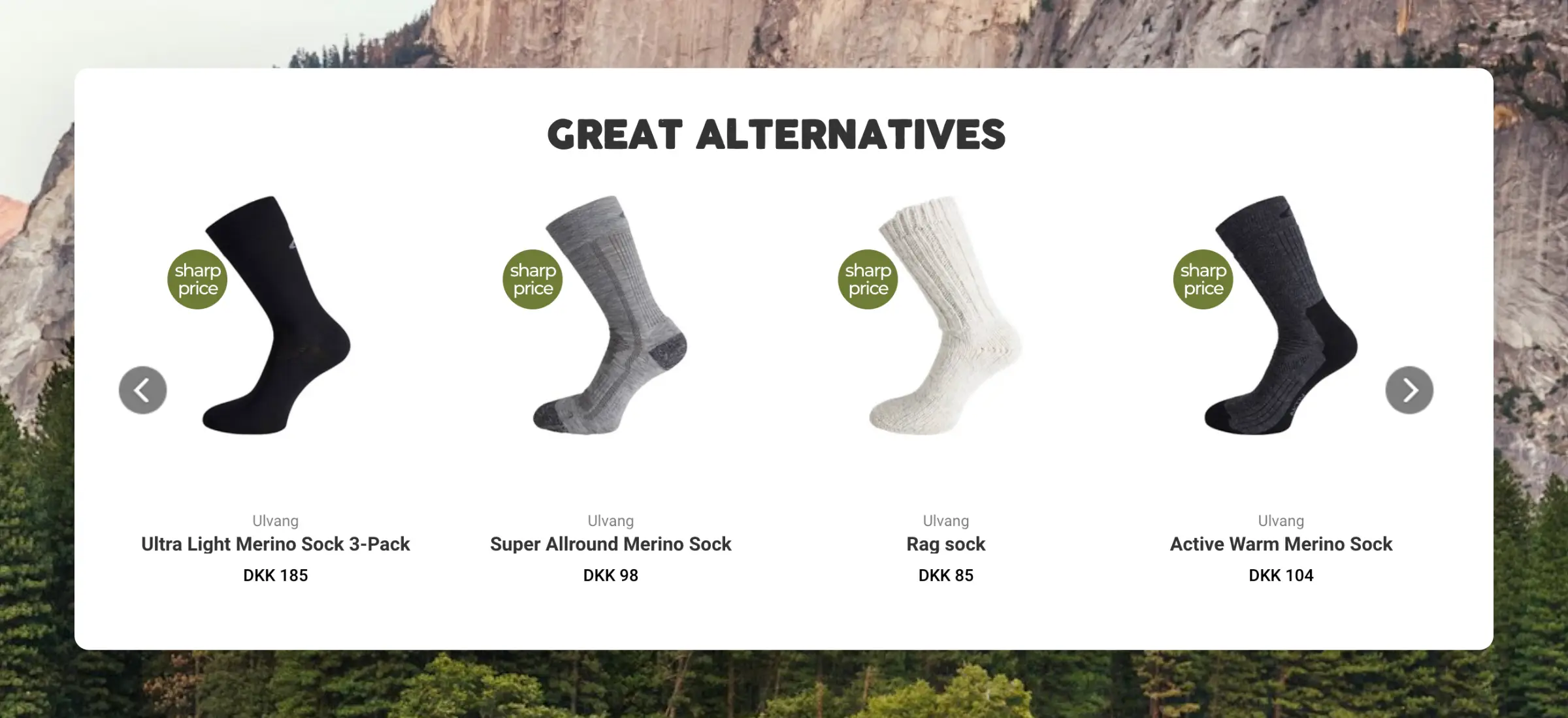
E.g. a vauge title could be “Related Products”. This does not tell the visitor what kind of relation they are browsing. Is it similar items, accessories or something else entirely?
A good title for your alternatives could be “Great alternatives for this” as it’s now clear that they should expect similar items to what they are browsing.
When using Clerks Setup Guides, each element has a good predefined english headline to get you started.
Sliders #
Recommendations can be styled in any way you want to, but we recommend using our built-in sliders functionality.

These make it easy for you to display many products without taking up too much space, by letting customers use the slider-arrows to see more products.
If you build your own custom sliders, we highly recommend showing a full new row of products for each click on a slider arrow, as this lets customers see more products with fewer clicks, leading to more conversions.
Branding #
Sliders should follow your brand style to become an integrated part of your site. Default designs can be tailored using either our Design Editor, or with code designs.
The most important elements to streamline are:
- Font family
- Font size
- Font color
- Button color
Visibility #
We as consumers get more and more impatient when using the internet. This means that we get used to seeing things we like quickly, or we tend to return to search engines like Google to find the next website.
That’s why your Recommendations banners should be partly visible from the get-go. The first banner on a page should ideally be placed visibly above the fold, which means that visitors can see them without scrolling down on a standard 13" laptop.
By showing at least the top of the headline, many more visitors will scroll down to see the Recommendations, which will lead to more conversions.
Optimize Regularly #
Clerks AI keeps search results up-to-date based on customer behaviour at all times, but there will be cases where a human touch is needed to take your results to the next level.
Analytics #
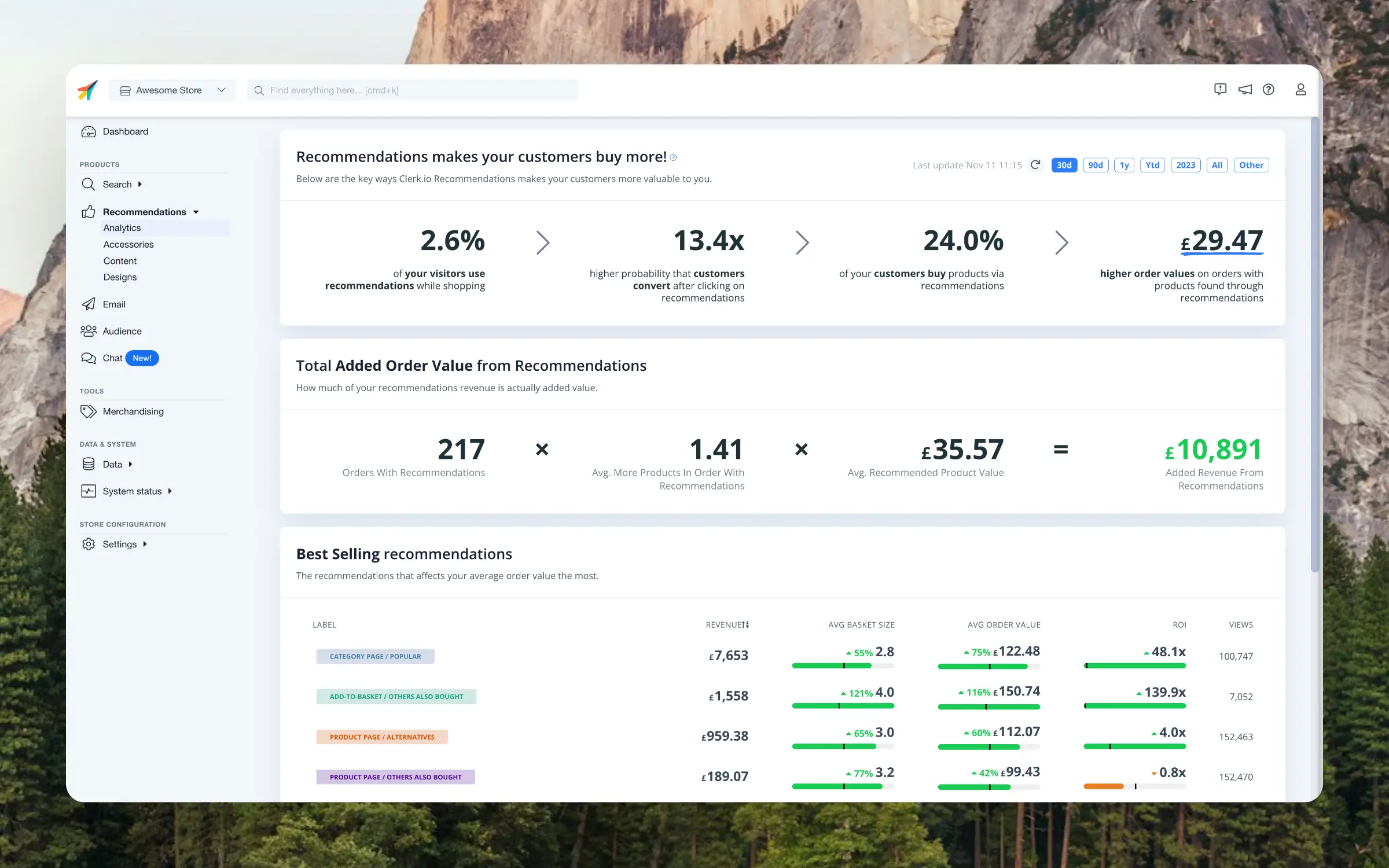
This dashboard helps you identify banners you can actively improve if they are not providing you with a good return on investment.

E.g. you might see that your Product Page Alternatives are not performing as expected - they have half as many orders as complementary products, but the same views.
Inspecting your product page, you realise that the Alternatives are placed far down on the page, almost by the footer, meaning that very few customers ever interact with them.
Another example could be that your Best Sellers in Category have a low ROI of just 2x and you want to double this. As a clothing Store, you decide to try using Hot Products in Category instead, which over the next month increases the ROI to 5x, because customers are more sensitive trends with your catalogue.
Reviewing this dashboard regularly allows you to find the best places to spend your time, when you want to optimise results even further.
Merchandising #
When you have specific marketing goals, like promoting your own whitelabel products or clearing your inventory of low-stock items, use Merchandising to quickly influence your Recommendations everywhere.
It takes less than 5 minutes to set up campaigns that tells Clerk to focus on the products that matter most to you right now.