Search
Clerk.io ofrece tres soluciones de búsqueda distintas que pueden utilizarse juntas o por separado:
- Un Instant Search desplegable.
- Una Search Page con filtrado de búsqueda facetada.
- Un overlay de Omnisearch que combina ambas.
Este artículo explica cómo empezar a utilizar una Clerk.js setup.
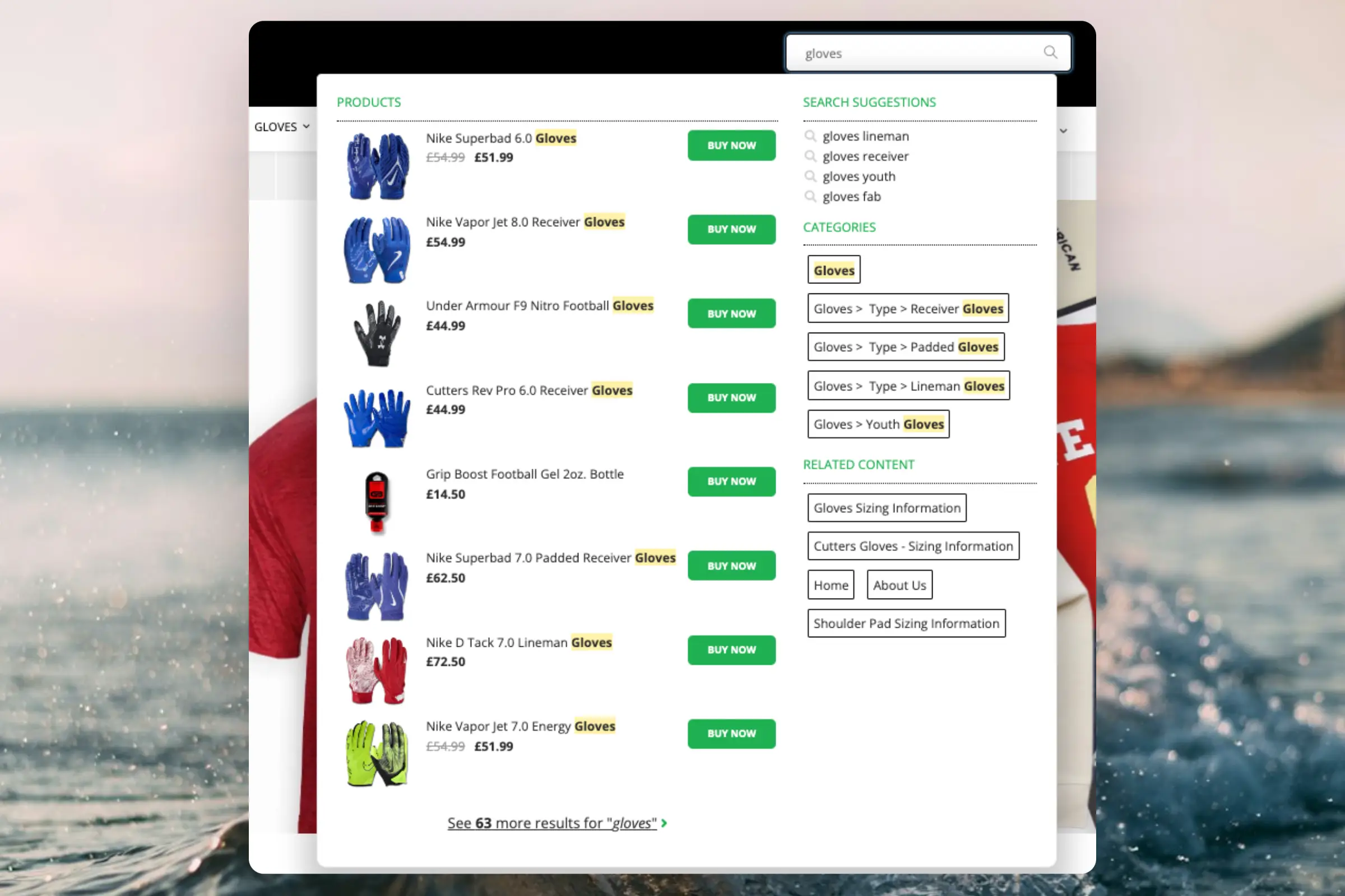
Instant Search #
Crear Diseño #
Puedes utilizar el Design Editor para configurarlo visualmente, o utilizar code designs.
Design Editor #
- Ve a Search > Designs y haz clic en New Design.
- Elige Other designs > Instant Search.
- De la lista de plantillas de diseño, selecciona con cuál deseas comenzar.
- Asígnale un nombre y haz clic en Create design.
- Realiza los cambios que desees en el diseño.
Code Design #
- Ve a Search > Designs y haz clic en New Design.
- Elige Other designs > Blank > With code.
- Asígnale un nombre y haz clic en Save.
- Crea un diseño con código desde cero utilizando Liquid code.
Si quieres un diseño inicial, consulta la Instant Search template más abajo.
Crear Elemento #
Esto contiene todos los ajustes utilizados para mostrar el desplegable de Instant Search y hacerlo embebible en tu sitio web.
- Ve a Search > Elements.
- Haz clic en New Element.
- Nómbralo “Live Search”.
- En Element type, selecciona Live-search en el desplegable.
- En Design, selecciona el diseño que creaste del desplegable.
- Haz clic en Save en la parte superior de la pantalla.
Añadir al sitio web #
- Desde la configuración del Elemento, abre la pestaña Insert into website.
- Aquí tienes dos opciones:
- Usar injection te permite insertar el código usando un selector CSS.
- Usar embedded code te permite insertar el código manualmente en tu sitio web.
- Elige la opción más fácil de usar para ti.
- Para embedded code, reemplaza
INSERT_SEARCH_INPUT_CSS_SELECTOR_HEREpor una clase única o un ID para tu campo de input de búsqueda. Esto hará que el Instant Search lo apunte y muestre resultados a medida que el usuario escriba.
Aquí tienes un ejemplo completo de código embebido para Instant Search:
<span class="clerk"
  data-template="@live-search"
  data-instant-search="INSERT_SEARCH_INPUT_CSS_SELECTOR_HERE"
  data-instant-search-suggestions="6"
  data-instant-search-categories="6"
  data-instant-search-pages="6"
  data-instant-search-positioning="right">
</span>
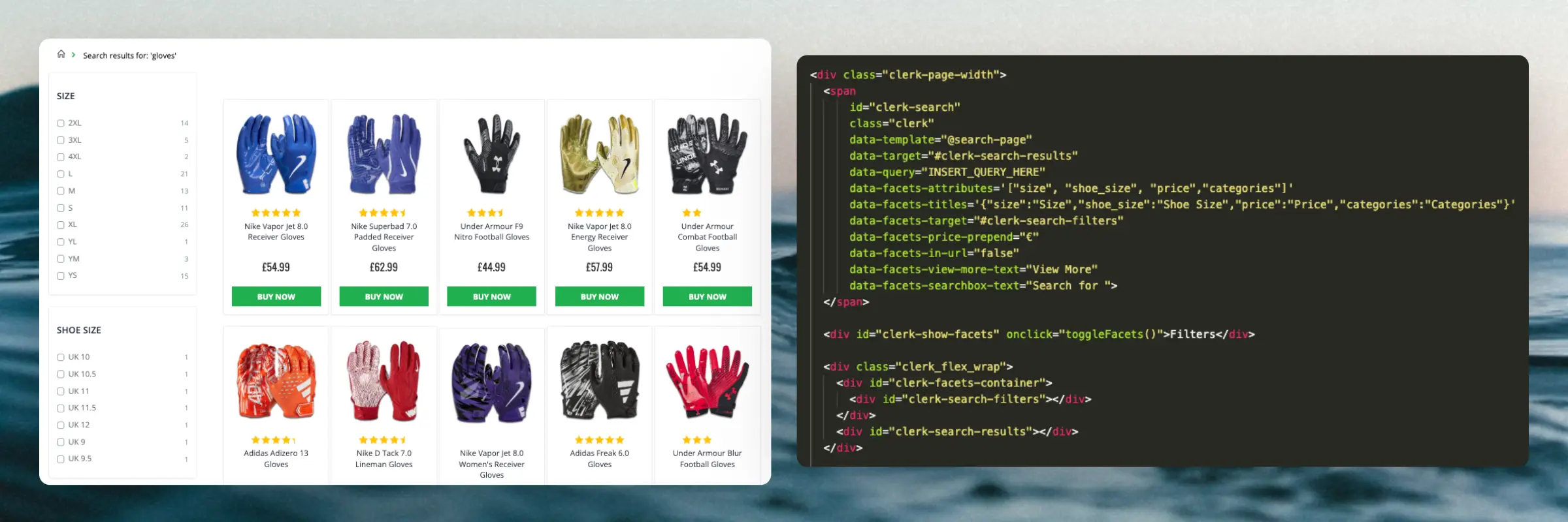
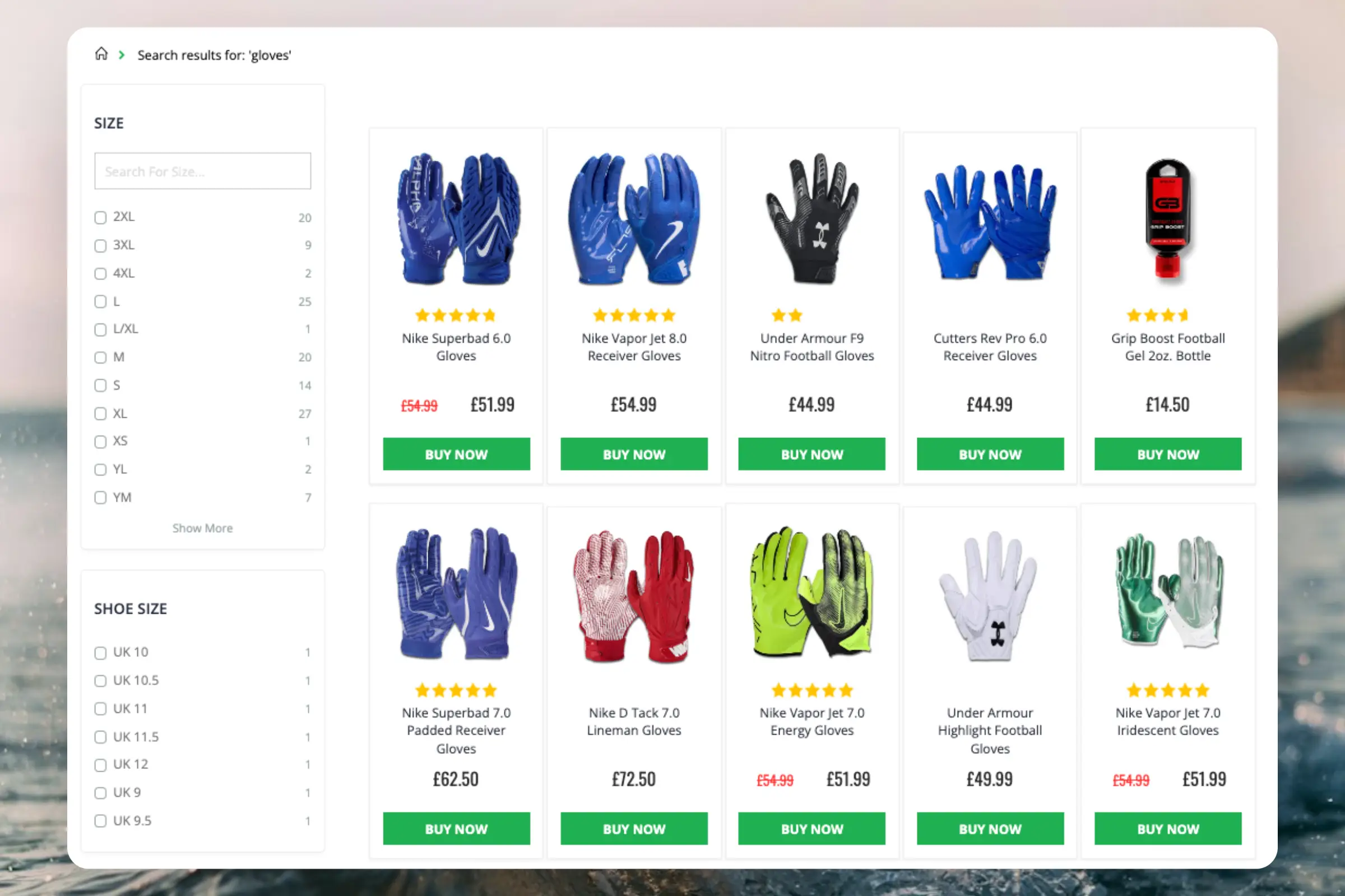
Search Page #
Crear Diseño #
Puedes utilizar el Design Editor para configurarlo visualmente, o utilizar code designs.
Design Editor #
- Ve a Search > Designs y haz clic en New Design.
- Elige Other designs > Search Page.
- De la lista de plantillas de diseño, selecciona con cuál deseas comenzar.
- Asígnale un nombre y haz clic en Create design.
- Realiza los cambios que desees en el diseño.
Code Design #
- Ve a Search > Designs y haz clic en New Design.
- Elige Other designs > Blank > With code.
- Asígnale un nombre y haz clic en Save.
- Crea un diseño con código desde cero utilizando Liquid code.
Si deseas un diseño inicial, consulta la Search Page template más abajo.
Crear Elemento #
Esto contiene todas las configuraciones usadas para mostrar la Search Page y hacerla embebible en tu página de búsqueda existente.
- Ve a Search > Elements.
- Haz clic en New Element.
- Nómbralo “Search Page”.
- En Element type, selecciona Search page del desplegable.
- En Design selecciona el diseño que creaste del desplegable.
- Haz clic en Save en la parte superior de la pantalla.
Añadir al sitio web #
- Desde la configuración del Elemento, abre la pestaña Insert into website.
- Aquí tienes dos opciones:
- Usar injection te permite insertar el código usando un selector CSS.
- Usar embedded code te permite insertar el código manualmente en tu sitio web.
- Elige la opción que te sea más fácil de usar.
- Añade el código a la plantilla que genera tu página de búsqueda existente.
- Desactiva cualquier funcionalidad de búsqueda existente.
Aquí tienes un ejemplo completo de código embebido para Search Page, incluyendo CSS para mostrar y ocultar facetas en dispositivos móviles:
<div class="clerk-page-width">
  <span
      id="clerk-search"
      class="clerk"
      data-template="@search-page"
      data-target="#clerk-search-results"
      data-query="INSERT_QUERY_HERE"
      data-facets-attributes='["price","categories","vendor"]'
      data-facets-titles='{"price":"Price","categories":"Categories","vendor":"Brand"}'
      data-facets-target="#clerk-search-filters"
      data-facets-price-prepend="€"
      data-facets-in-url="false"
      data-facets-view-more-text="View More"
      data-facets-searchbox-text="Search for ">
  </span>

  <div id="clerk-show-facets" onclick="toggleFacets()">Filters</div>

  <div class="clerk_flex_wrap">
    <div id="clerk-facets-container">
      <div id="clerk-search-filters"></div>
    </div>
    <div id="clerk-search-results"></div>
  </div>

  <script>
    function toggleFacets(){
      el = document.getElementById('clerk-facets-container');
      el.classList.toggle('active');
    }
  </script>

  <style>
    #clerk-show-facets {
        width: 70%;
        height: 40px;
        margin: 20px auto;
        background-color: #333;
        color: white;
        text-align: center;
        border-radius: 2px;
        line-height: 40px;
        cursor: pointer;
    }

    .clerk-page-width {
        display: flow-root;
    }

    #clerk-search-results {
        width: 80%;
    }

    #clerk-show-facets {
        display: none;
    }

    .clerk_flex_wrap {
        display: flex;
        flex-direction: row;
    }

    .active {
      display: block !important;
    }

    @media only screen and (max-width : 800px) {
      #clerk-search-filters {
        width: 100% !important;
      }

      #clerk-facets-container {
        display: none;
      }
      #clerk-show-facets {
          display: block;
      }
      .clerk_flex_wrap {
        flex-direction: column;
      }
      #clerk-search-results {
          display: block;
          width: 100%;
      }
    }
  </style>
</div>
Omnisearch #
Crear Diseño #
Omnisearch solo funciona con code designs, ya que tiene un layout más complejo que se puede modificar de cualquier manera que desees.
- Ve a Search > Designs y haz clic en New Design.
- Elige Omni-search.
- De la lista de plantillas de diseño, selecciona con cuál deseas comenzar.
- Asígnale un nombre y haz clic en Save.
- Haz los ajustes que desees al diseño. La Omnisearch guide tiene más información sobre cómo hacerlo.
Crear Elemento #
Esto contiene todas las configuraciones utilizadas para mostrar Omnisearch y hacerla embebible en tu sitio web.
- Ve a Search > Elements.
- Haz clic en New Element.
- Nómbralo “Omni-Search”.
- Añade una etiqueta de seguimiento - esto también debería ser solo “Omni-Search”.
- En Element type, selecciona Omni-search del desplegable.
- En Design selecciona el diseño que creaste en el desplegable.
- Haz clic en Save en la parte superior de la pantalla.
Añadir al sitio web #
- Desde la configuración del Elemento, abre la pestaña Insert into website.
- Aquí tienes dos opciones:
- Usar injection te permite insertar el código usando un selector CSS.
- Usar embedded code te permite insertar el código en tu sitio web manualmente.
- Elige la opción que te sea más sencilla de utilizar.
- Si utilizas la opción embedded code, reemplaza
INSERT_CSS_SELECTOR[...]con una clase única o ID para tu campo de entrada de búsqueda. Omnisearch se mostrará cuando el campo de entrada coincidente con el selector sea clicado.
Aquí tienes un ejemplo de código embebido completo para Omni-search:
<span class="clerk"
  data-template="@omni-search"
  data-api="search/omni"
  data-trigger-element="#search"
></span>
Plantillas Iniciales #
Si deseas usar code designs, estas plantillas pueden ayudarte a empezar. Contienen los elementos básicos de la interfaz de usuario que componen el Instant Search y la Search Page, que luego puedes modificar según tus necesidades.
Instant Search Code #
Esto contiene las partes HTML y CSS para mostrar un desplegable de Instant Search. Añade esto a un code design en my.clerk.io.
HTML #
<div class="clerk-instant-search">
    {% if hits.length == 0 %}
        <div class="clerk-instant-search-no-results">
            Nothing matched: <b>{{ query }}</b>... try a simpler search!
        </div>
    {% endif %}

    {% if content.query != response.query %}
        <div class="clerk-instant-search-alternate-query">
            <i class="fas fa-search clerk-icon" aria-hidden="true"></i> Showing results for: <b>{{ query }}</b>
        </div>
    {% endif %}

    <div class="clerk-instant-search-grid">
        {% if products.length > 0 %}
            <div class="clerk-instant-search-col clerk-col-1">
                <div class="clerk-instant-search-products">
                    <div class="clerk-instant-search-title">Products</div>
                    {% for product in products %}
                        <a href="{{ product.url }}">
                            <div class="clerk-instant-search-product clerk-instant-search-key-selectable">
                                <div class="clerk-instant-search-product-image" style="background-image: url('{{ product.image }}');"></div>

                                <div>
                                    <div class="clerk-instant-search-product-name">{{ product.name | highlight query }}</div>

                                    {% if product.price < product.list_price %}
                                        <div class="clerk-instant-search-product-list-price">{{ product.list_price | money }}</div>
                                    {% endif %}
                                    <div class="clerk-instant-search-product-price">{{ product.price | money }}</div>
                                </div>

                                <div>
                                    <div class="clerk-instant-search-product-button">Buy Now</div>
                                </div>
                            </div>
                        </a>
                    {% endfor %}

                    {% if hits > products.length %}
                        <div class="clerk-desktop-button clerk-instant-search-more-results clerk-instant-search-key-selectable">
                            <a class="clerk-view-more-results-button" href="/search?q={{ query }}">
                                <u>See <b>{{ hits }}</b> more results for "<i>{{ query }}</i>"</u>
                            </a>
                        </div>
                    {% endif %}
                </div>
            </div>
        {% endif %}

        {% if (suggestions.length + categories.length + pages.length) > 0 %}
            <div class="clerk-instant-search-col clerk-col-2">
                {% if suggestions.length > 1 %}
                    <div class="clerk-instant-search-suggestions">
                        <div class="clerk-instant-search-title">Search Suggestions</div>
                        {% for suggestion in suggestions %}
                            {% if suggestion != query %}
                                <div class="clerk-instant-search-suggestion clerk-instant-search-key-selectable">
                                    <a href="/search?q={{ suggestion highlight query 'bold' true }}">
                                    <i class="fas fa-search clerk-icon" aria-hidden="true"></i>{{ suggestion }}
                                    </a>
                                </div>
                            {% endif %}
                        {% endfor %}
                    </div>
                {% endif %}

                {% if categories.length > 0 %}
                    <div class="clerk-instant-search-categories">
                        <div class="clerk-instant-search-title">Categories</div>
                        {% for category in categories %}
                            <div class="clerk-instant-search-category clerk-instant-search-key-selectable">
                                <a href="{{ category.url }}">
                                    {{ category.name | highlight query }}
                                </a>
                            </div>
                        {% endfor %}
                    </div>
                {% endif %}

                {% if pages.length > 0 %}
                    <div class="clerk-instant-search-pages">
                        <div class="clerk-instant-search-title">Related Content</div>
                        {% for page in pages %}
                            <div class="clerk-instant-search-category clerk-instant-search-key-selectable">
                                <a href="{{ page.url }}">
                                    <div class="name">{{ page.title | highlight query 'bold' true }}</div>
                                </a>
                            </div>
                        {% endfor %}
                    </div>
                {% endif %}
            </div>
        {% endif %}
         {% if hits > products.length %}
            <div class="clerk-mobile-button clerk-instant-search-more-results clerk-instant-search-key-selectable">
                <a href="/search?q={{ query }}">
                    See <b>{{ hits }}</b> more results for "<i>{{ query }}</i>"
                </a>
            </div>
        {% endif %}
    </div>
</div>
CSS #
.clerk-instant-search {
    padding: 20px;
}

.clerk-instant-search-container a {
    color: black !important;
    text-decoration: none !important;
}

.clerk-instant-search-container a:hover {
    color: #b6c254; !important;
}

.clerk-instant-search {
    overflow: hidden;

    width: 100%;
    min-width: 650px;
    max-width: 1000px;

    margin: .2em auto;

    background-color: white;

    border: 1px solid #eee;
    border-top: 0px;

    border-radius: 5px 5px 10px 10px;

    box-shadow: 0 1em 2em 1em rgba(0,0,0,.2);
}

.clerk-instant-search-no-results {
    padding: 1em;

    font-style: italic;

    text-align: center;
}

.clerk-instant-search-alternate-query {
    margin: 0px 0px 5px 0px;
}

.clerk-instant-search-more-results {
    padding: 1em;

    font-size: 1.2em;

    text-align: center;
}

.clerk-instant-search-title {
    color: #b6c254;
    margin: 20px 0px 5px 0px;
    padding: 0px 0px 10px 0px;
    text-transform: uppercase;
    font-size: 1em;
    border-bottom: 1px solid #000000;
}


/* Products */
.clerk-instant-search-products {
    padding-right: 2em;
}

.clerk-instant-search-product {
    display: flex;

    padding: .2em;

    color: gray;
}

.clerk-instant-search-product:hover {
    background-color: rgba(46, 204, 113, .1);
}

.clerk-instant-search-product:hover .clerk-instant-search-product-button {
    transform: scale(1.05);
}

.clerk-instant-search-product > * {
    flex: 1 1 auto;
}
.clerk-instant-search-product > *:first-child, .clerk-instant-search-product > *:last-child {
    flex: 0 0 auto;
}

.clerk-instant-search-product-image {
    display: inline-block;

    width: 3em;
    height: 3em;

    margin-right: 1em;

    background-position: center center;
    background-repeat: no-repeat;
    background-size: contain;
}

.clerk-instant-search-product-name {
    overflow: hidden;

    height: 1.2em;

    margin-bottom: .2em;
}

.clerk-instant-search-product-list-price {
    display: inline-block;

    margin-right: .5em;

    opacity: .8;

    font-weight: normal;
    text-decoration: line-through;
    color: gray;
}

.clerk-instant-search-product-price {
    display: inline-block;

    font-weight: bold;
}

.clerk-instant-search-product-button {
    display: block;

    margin: .2em auto;
    padding: .8em 2em;

    border: none;
    border-radius: .5em;

    background-color: #b6c254;
    color: white;

    text-transform: uppercase;
    text-align: center;

    white-space: nowrap;

    font-weight: bold;
    font-size: .8em;

    cursor: pointer;
}

/* Suggestions */

.clerk-icon {
    color: lightgray;
    margin-right: .5em;
}

.clerk-instant-search-suggestions {
    margin-bottom: 1em;
}

.clerk-instant-search-suggestion {
    padding: .1em;
}


/* Categories */
.clerk-instant-search-categories {
    margin-bottom: 1em;
}

.clerk-instant-search-category {
    padding: 5px;
    margin: 5px;
    width: auto;
    display: inline-block;
    border: 1px solid black;
    border-radius: 2px;
}


/* Pages */
.clerk-instant-search-pages {
    margin-bottom: 1em;
}

.clerk-instant-search-page {
    padding: .1em;
}

@media screen and (min-width: 1200px) {
    .clerk-instant-search-container {
        width: 50%;
    }
    .clerk-instant-search-grid {
        display: flex;
    }

    .clerk-col-1 {
        flex: 2;
    }

    .clerk-col-2 {
        flex: 1;
    }

    .clerk-mobile-button {
        display: none;
    }
}

@media screen and (min-width: 768px) and (max-width: 1200px){
    .clerk-instant-search-container {
        right: 0px !important;
        left: 0px !important;
    }
    .clerk-mobile-button {
        display: none;
    }
}

@media screen and (max-width: 767px) {
    .clerk-instant-search-container {
        right: 0px !important;
    }
    .clerk-desktop-button {
        display: none;
    }
}

@media screen and (min-width: 376px) and (max-width: 800px) {
    .clerk-instant-search {
            min-width: 0px !important;
    }
}

@media screen and (max-width: 375px) {
    .clerk-instant-search {
        min-width: 200px !important;
    }
    .clerk-instant-search-col {
        margin: 0px 0px 20px 0px;
    }
    .clerk-instant-search-product-name {
        height: 3em !important;
    }
}
Search Page Code #
Esto contiene las partes HTML y CSS para mostrar una Search Page. Añade esto a un code design en my.clerk.io.
HTML #
<div class="clerk-search-result">
<div class="clerk-search-result-headline">{{ headline }}</div>
<div class="clerk-grid">
{% for product in products %}
<div class="clerk-grid-item">
<div class="clerk-grid-product">
<a href="{{ product.url }}">
{% if product.price < product.list_price %}
<div class="clerk-grid-badge">On Sale</div>
{% endif %}
<div class="clerk-grid-image" style="background-image: url('{{ product.image }}');"></div>
<div class="clerk-grid-brand">{{ product.brand }}</div>
<div class="clerk-grid-name">{{ product.name }}</div>
<div class="clerk-grid-pricing">
{% if product.price < product.retail_price %}
<div class="clerk-grid-list-price">£{{ product.retail_price | money }}</div>
{% endif %}
<div class="clerk-grid-price">£{{ product.price | money }}</div>
</div>
</a>
{% if product.stock == 1 %}
<a class="clerk-not-in-stock" href="{{ product.url }}" data-event-type="product-click">
<div class="clerk-grid-button-not-in-stock">Out of Stock</div>
</a>
{% else %}
<a class="clerk-add-to-cart" href="/cart.php?action=add&product_id={{ product.id }}" data-event-type="product-click">
<div class="clerk-grid-button">Add to Cart</div>
</a>
{% endif %}
</div>
</div>
{% endfor %}
</div>
{% if count > products.length %}
<div class="clerk-load-more-button" onclick="Clerk('content', '#{{ content.id }}', 'more', 40);">Show More Results</div>
{% endif %}
</div>
CSS #
#clerk-search-results {
    margin: 0px;
}

.clerk-search-result {
    margin: 1em 0;
}

.clerk-search-result-headline {
    font-weight: bold;
    font-size: 2em;

    text-align: center;
}

.clerk-grid {
    display: flex;
    flex-flow: row wrap;
}

.clerk-grid-item {
    margin: auto;
}

.clerk-grid-product {
    position: relative;
    overflow: hidden;

    margin: 1em;
    padding: 1em;

    background-color: white;

    border: 1px solid #eee;
    border-radius: 1em;

    box-shadow: 0 .1em .2em 0 rgba(0,0,0,.08);

    text-align: center;
}

.clerk-grid-badge {
    position: absolute;
    top: 5px;
    right: -35px;

    display: inline-block;

    width: 120px;

    margin: 10px auto;
    padding: 5px 0;

    border-radius: 3px;

    background-color: #fbc531;

    font-size: 10px;
    color: white;

    text-align: center;
    letter-spacing: 1px;

    transform: rotate(45deg);
}

.clerk-grid-tags {
    position: absolute;
    top: .8em;
    left: .8em;
}

.clerk-grid-tag {
    display: inline-block;

    padding: .2em .8em;

    border-radius: .3em;

    background-color: gray;

    font-size: 10px;
    color: white;

    letter-spacing: 1px;
}

.clerk-grid-image {
    width: 100%;
    height: 8em;

    margin-bottom: 1em;

    background-position: center center;
    background-repeat: no-repeat;
    background-size: contain;
}

.clerk-grid-brand {
    font-size: 0.9em;
    color: #757575;;
}

.clerk-grid-name {
    height: 3em;
    overflow: hidden;
    color: #4a3b40;
    font-weight:bold;
    font-size: 15px;
    margin-bottom: 1em;
}

.clerk-grid-pricing {
    display: flex;

    margin-bottom: 1em;
}

.clerk-grid-price {
    flex: 1;
    color: #757575;
    font-weight: bold;
}

.clerk-grid-list-price {
    flex: 1;

    opacity: .8;

    font-weight: normal;
    text-decoration: line-through;
    color: gray;
}

.clerk-add-to-cart, .clerk-add-to-cart:hover {
    color: white;
}

.clerk-not-in-stock, .clerk-not-in-stock:hover {
    color: #4a3b40;
}

.clerk-grid-button-not-in-stock {
    display: block;

    margin: 0 auto;
    padding: .6em 2em;

    border: none;
    border-radius: .5em;

    background-color: white;
    color: #4a3b40;

    text-transform: uppercase;
    text-align: center;

    white-space: nowrap;

    font-weight: bold;

    cursor: pointer;
}

.clerk-grid-button {
    display: block;

    margin: 0 auto;
    padding: .6em 2em;

    border: none;
    border-radius: .5em;

    background-color: #b6c254;
    color: white;

    text-transform: uppercase;
    text-align: center;

    white-space: nowrap;

    font-weight: bold;

    cursor: pointer;
}


.clerk-load-more-button {
    display: block;

    width: 20em;

    margin: 1em auto;
    padding: .6em 2em;

    border: none;
    border-radius: .5em;

    background-color: #b6c254;
    color: white;

    text-transform: uppercase;
    text-align: center;

    white-space: nowrap;

    font-weight: bold;
    font-size: 1.2em;

    cursor: pointer;
}

@media screen and (min-width: 1025px) {
    .clerk-grid-item {
        flex: 0 0 25%;
        margin: auto;
    }
}

@media screen and (min-width: 500px) and (max-width: 1024px) {
    .clerk-grid-item {
        flex: 0 0 33%;
        margin: auto;
    }
}

@media screen and (max-width: 499px) {
    .clerk-grid-item {
        flex: 0 0 100%;
        margin: auto;
    }
}
Esta página ha sido traducida por una IA útil, por lo que puede contener errores de idioma. Muchas gracias por su comprensión.