Styling Clerk.io's Slider Arrows
Check which classes you need to modify
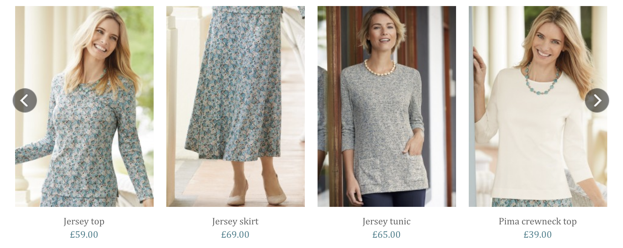
Clerk.js comes with a built-in function for showing products with sliders.
This function has a standard set of arrows, that lets customers navigate the slider as shown below:
However, if you want to use your own slider-arrows, or want to change their placement, you can use these classes, to modify them:
<style type="text/css">
    @keyframes arrowPop {
        0% {
            width:20%;
        }
        50% {
            width:0%;
        }
        100% {
            width: 20%;
        }
    }

    .clerk-slider-nav {
        background: #333;
        border-radius:50%;
        display:flex;
        justify-content:center;
        align-items:center;
        font-size:0;
        opacity:0.8;
        filter: drop-shadow(0 0 5px #333);
        transition:0.3s ease;
    }

    .clerk-slider-nav:hover {
        opacity:1;
        transition:0.3s ease;
    }
    .clerk-slider-nav:hover:before {
        animation:arrowPop 0.3s ease;
    }
    .clerk-slider-nav-next {
        flex-direction:row-reverse;
    }

    .clerk-slider-nav:after {
        content:"";
        display:block;
        height:40%;
        width:40%;
        transform: rotate(45deg);
        border: solid white;
    }
    .clerk-slider-nav-prev:after {
        border-width: 0px 0px 2px 2px;
    }

    .clerk-slider-nav-next:after {
        border-width: 2px 2px 0px 0px;
    }

    .clerk-slider-nav:before {
        content:"";
        width:20%;
    }
</style>
The new styling can be added in your existing stylesheet, or as part of a Design in my.clerk.io.