Search
General #
Add powerful search functionality to your BigCommerce webshop. Clerk.io offers three complementary search solutions:
- An Instant Search dropdown.
- A Search Page with faceted filters.
- An Omnisearch overlay that combines both.
Instant Search #
Instant Search provides real-time results as customers type, displayed in a dropdown below the search field.
Create Design #
Use the Design Editor or code designs.
Design Editor #
- Go to Search > Designs and click New Design.
- Choose Other designs > Instant Search.
- Pick a template to start from.
- Name it and click Create design.
- Adjust the design as needed.
Code Design #
- Go to Search > Designs and click New Design.
- Choose Other designs > Blank > With code.
- Name it and click Save.
- Build a code design using Liquid.
Create Element #
This holds the settings to show the Instant Search dropdown and make it embeddable.
- Go to Search > Elements.
- Click New Element.
- Name it “Live Search”.
- In Element type, select Live-search.
- In Design, select the design you created.
- Click Save.
Add to Website #
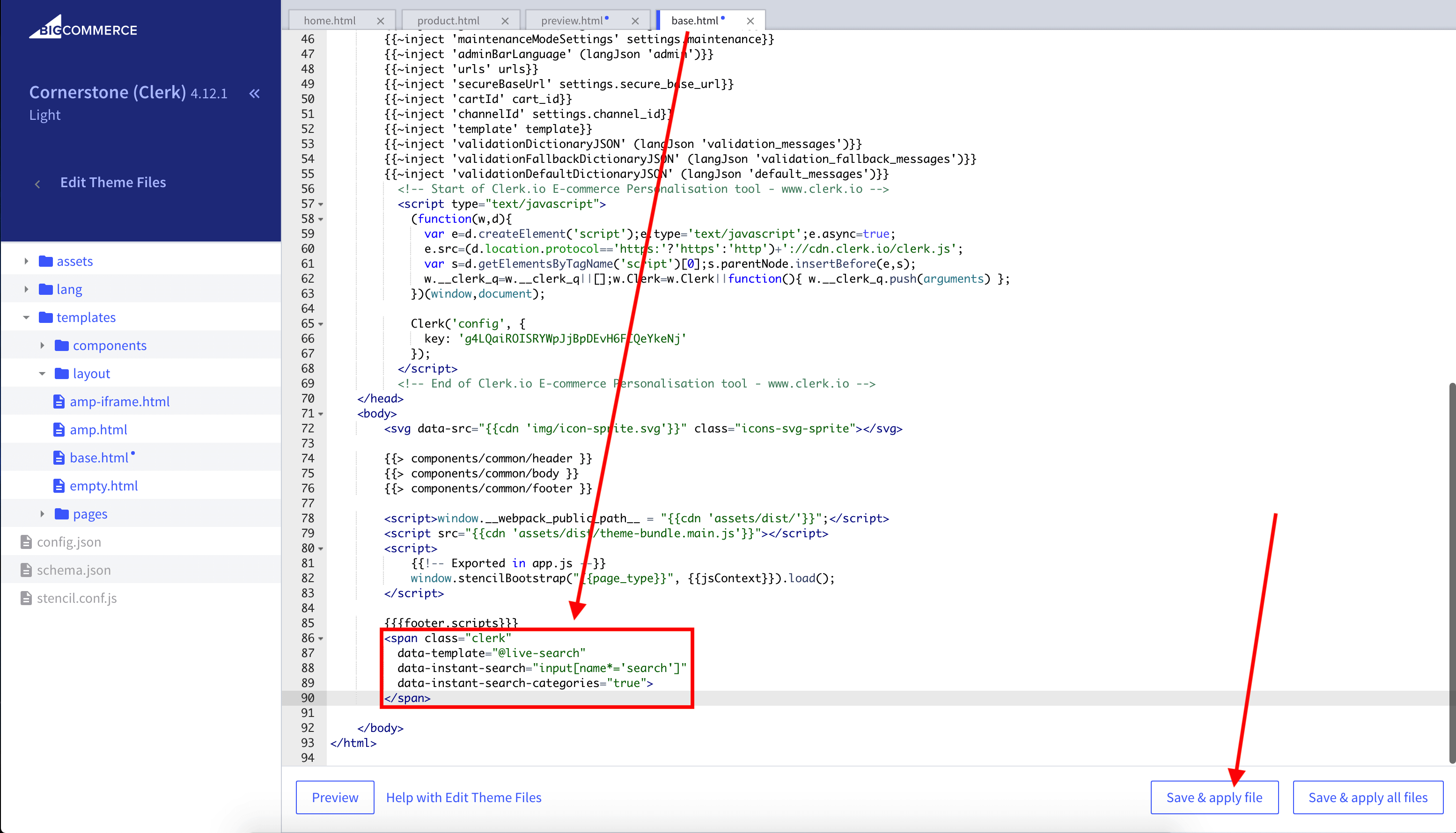
- In BigCommerce go to Storefront > My Themes > Advanced > Edit Theme Files.
- Open Templates > Layout > base.html.
- Insert the embed code just before the closing
</body>tag. Replace@YOUR_ELEMENT_IDwith your Element ID if needed, and update the selector indata-instant-searchto match your site’s search input.
<span
  class="clerk"
  data-template="@YOUR_ELEMENT_ID"
  data-instant-search="input[name*='search']"
  data-instant-search-positioning="left"
  data-instant-search-categories="6"
  data-instant-search-pages="6"
  data-instant-search-suggestions="6">
</span>
Tip: If your theme uses a different input on mobile, add a second embed with the mobile selector.
As an alternative, you can use injection.
Search Page #
The Search Page provides a full-page search experience with advanced filtering.
Create Design #
Use the Design Editor or code designs.
Design Editor #
- Go to Search > Designs and click New Design.
- Choose Other designs > Search Page.
- Pick a template to start from.
- Name it and click Create design.
- Adjust the design as needed.
Code Design #
- Go to Search > Designs and click New Design.
- Choose Other designs > Blank > With code.
- Name it and click Save.
- Build a code design using Liquid.
Create Element #
This holds the settings to render the Search Page and embed it into your theme.
- Go to Search > Elements.
- Click New Element.
- Name it “Search Page”.
- In Element type, select Search page.
- In Design, select the design you created.
- Click Save.
Add to Website #
- In BigCommerce go to Storefront > My Themes > Advanced > Edit Theme Files.
- Open Templates > Pages > search.html.
- Comment out the existing search HTML by adding
<!--at the start of the page markup.
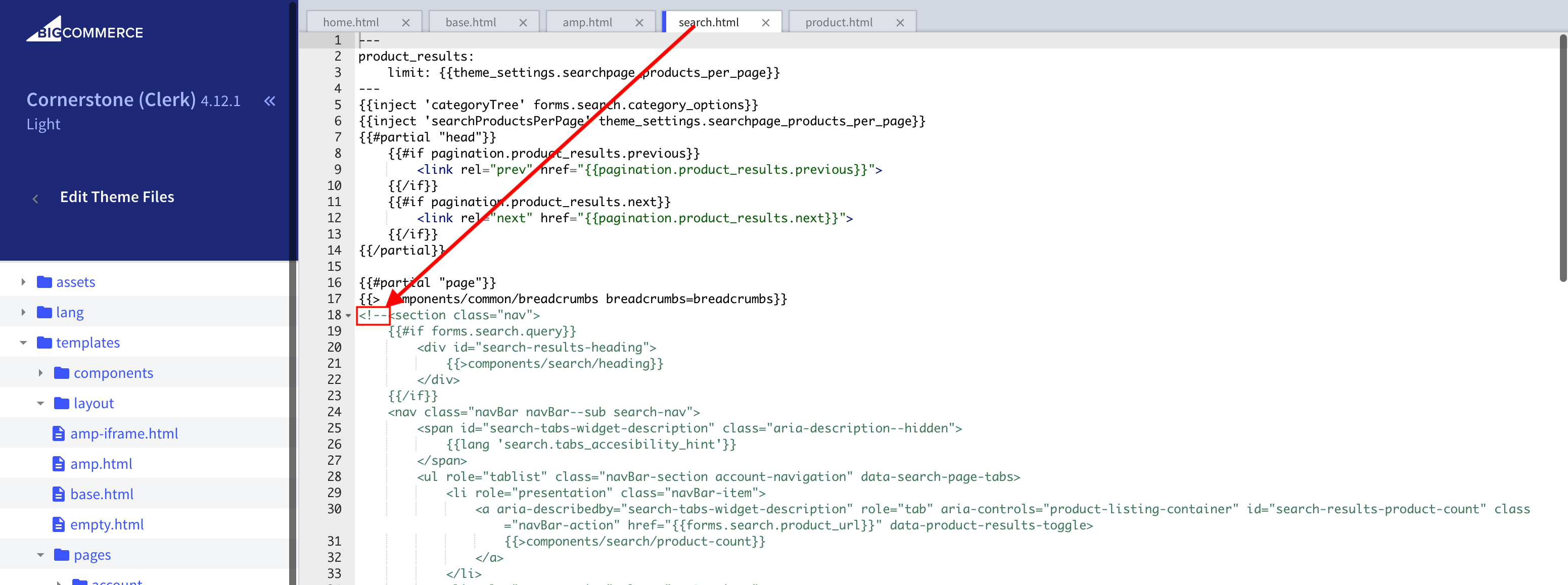
- Scroll to the bottom of the page and add
-->after the end of the HTML.
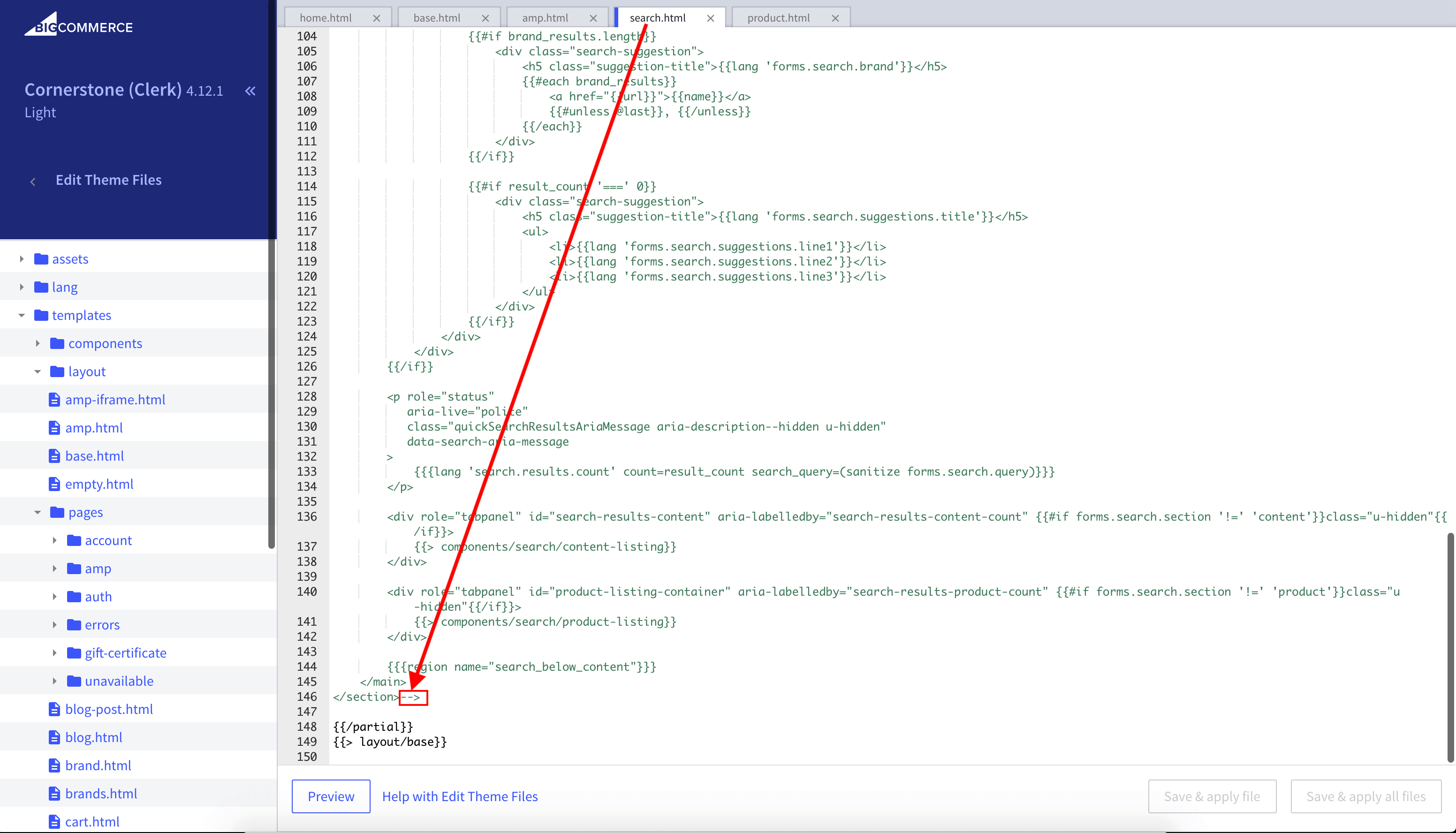
- Insert the embed code right after the existing HTML. Replace
data-querywith your page query if your theme differs.
<div class="page-width clerk-page-width">
  <span
    id="clerk-search"
    class="clerk"
    data-template="@YOUR_ELEMENT_ID"
    data-target="#clerk-search-results"
    data-query="{{ '{' + '{ forms.search.query }' + '}'}}"
    data-facets-attributes='["price","categories"]'
    data-facets-titles='{"price":"Price","categories":"Categories"}'
    data-facets-target="#clerk-search-filters"
    data-facets-price-prepend="€"
    data-facets-in-url="false"
    data-facets-view-more-text="View More"
    data-facets-searchbox-text="Search for ">
  </span>

  <div id="clerk-show-facets" onclick="toggleFacets()">Filters</div>

  <div class="clerk_flex_wrap">
    <div id="clerk-facets-container">
      <div id="clerk-search-filters"></div>
    </div>
    <div id="clerk-search-results"></div>
  </div>
</div>

<script>
  function toggleFacets(){
    var el = document.getElementById('clerk-facets-container');
    el.classList.toggle('active');
  }
</script>
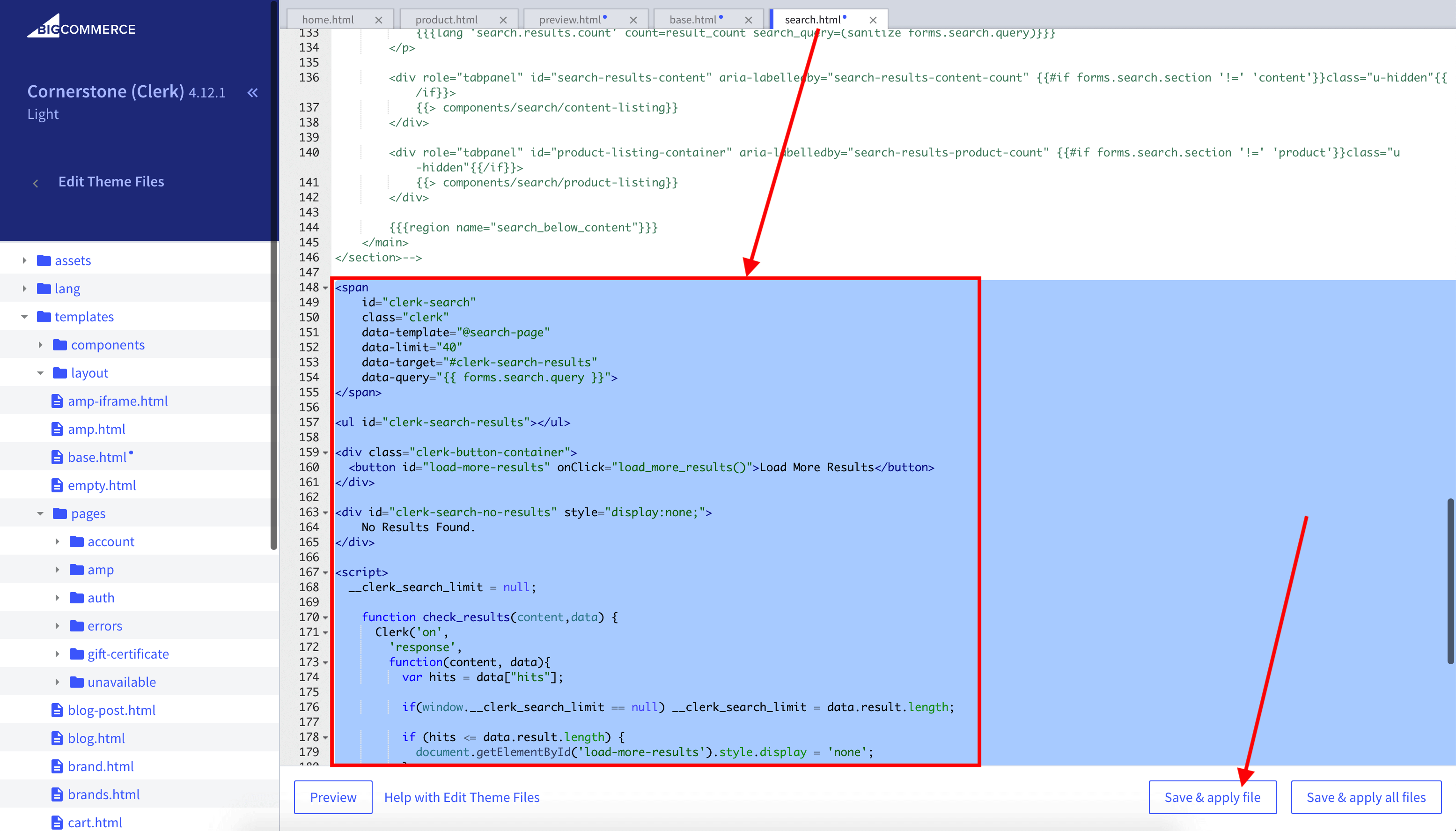
- Click Save & apply file.
Facets #
Clerk.js includes built-in Faceted Search for the Search Page. Any product attributes sent to Clerk.io can be used as filters.
To enable facets, add the facet attributes to your embed code (as in the example above). You can style facets using CSS in the same file.
For a full overview, see the Facets guide.
Omnisearch #
The Omnisearch combines the Instant Search and Search Page in a single overlay that appears when the user focuses the search input.
Create Design #
Omnisearch uses code designs.
- Go to Search > Designs and click New Design.
- Choose Omni-search.
- Pick a template, name it and click Save.
- Adjust as needed. See the Omnisearch guide.
Create Element #
- Go to Search > Elements.
- Click New Element.
- Name it “Omni-Search” and add a tracking label, e.g. “Omni-Search”.
- In Element type, select Omni-search.
- In Design, select the design you created.
- Click Save.
Add to Website #
- From the Element settings, open Insert into website.
- Choose either injection or embedded code.
- If you use embedded code, set
data-trigger-elementto the selector of your search field.
Example:
<span class="clerk"
  data-template="@omni-search"
  data-api="search/omni"
  data-trigger-element="#search"
></span>
Starting Templates #
If you want to use code designs, these templates can get you started. They contain the basic UI elements that make up the Instant Search and Search Page, which you can then modify to your needs.
Instant Search Code #
This contains the HTML and CSS parts for displaying an Instant Search dropdown. Add these to a code design in my.clerk.io.
HTML #
<div class="clerk-instant-search">
    {% if hits.length == 0 %}
        <div class="clerk-instant-search-no-results">
            Nothing matched: <b>{{ query }}</b>... try a simpler search!
        </div>
    {% endif %}

    {% if content.query != response.query %}
        <div class="clerk-instant-search-alternate-query">
            <i class="fas fa-search clerk-icon" aria-hidden="true"></i> Showing results for: <b>{{ query }}</b>
        </div>
    {% endif %}

    <div class="clerk-instant-search-grid">
        {% if products.length > 0 %}
            <div class="clerk-instant-search-col clerk-col-1">
                <div class="clerk-instant-search-products">
                    <div class="clerk-instant-search-title">Products</div>
                    {% for product in products %}
                        <a href="{{ product.url }}">
                            <div class="clerk-instant-search-product clerk-instant-search-key-selectable">
                                <div class="clerk-instant-search-product-image" style="background-image: url('{{ product.image }}');"></div>

                                <div>
                                    <div class="clerk-instant-search-product-name">{{ product.name | highlight query }}</div>

                                    {% if product.price < product.list_price %}
                                        <div class="clerk-instant-search-product-list-price">{{ product.list_price | money }}</div>
                                    {% endif %}
                                    <div class="clerk-instant-search-product-price">{{ product.price | money }}</div>
                                </div>

                                <div>
                                    <div class="clerk-instant-search-product-button">Buy Now</div>
                                </div>
                            </div>
                        </a>
                    {% endfor %}

                    {% if hits > products.length %}
                        <div class="clerk-desktop-button clerk-instant-search-more-results clerk-instant-search-key-selectable">
                            <a class="clerk-view-more-results-button" href="/search?q={{ query }}">
                                <u>See <b>{{ hits }}</b> more results for "<i>{{ query }}</i>"</u>
                            </a>
                        </div>
                    {% endif %}
                </div>
            </div>
        {% endif %}

        {% if (suggestions.length + categories.length + pages.length) > 0 %}
            <div class="clerk-instant-search-col clerk-col-2">
                {% if suggestions.length > 1 %}
                    <div class="clerk-instant-search-suggestions">
                        <div class="clerk-instant-search-title">Search Suggestions</div>
                        {% for suggestion in suggestions %}
                            {% if suggestion != query %}
                                <div class="clerk-instant-search-suggestion clerk-instant-search-key-selectable">
                                    <a href="/search?q={{ suggestion highlight query 'bold' true }}">
                                    <i class="fas fa-search clerk-icon" aria-hidden="true"></i>{{ suggestion }}
                                    </a>
                                </div>
                            {% endif %}
                        {% endfor %}
                    </div>
                {% endif %}

                {% if categories.length > 0 %}
                    <div class="clerk-instant-search-categories">
                        <div class="clerk-instant-search-title">Categories</div>
                        {% for category in categories %}
                            <div class="clerk-instant-search-category clerk-instant-search-key-selectable">
                                <a href="{{ category.url }}">
                                    {{ category.name | highlight query }}
                                </a>
                            </div>
                        {% endfor %}
                    </div>
                {% endif %}

                {% if pages.length > 0 %}
                    <div class="clerk-instant-search-pages">
                        <div class="clerk-instant-search-title">Related Content</div>
                        {% for page in pages %}
                            <div class="clerk-instant-search-category clerk-instant-search-key-selectable">
                                <a href="{{ page.url }}">
                                    <div class="name">{{ page.title | highlight query 'bold' true }}</div>
                                </a>
                            </div>
                        {% endfor %}
                    </div>
                {% endif %}
            </div>
        {% endif %}
         {% if hits > products.length %}
            <div class="clerk-mobile-button clerk-instant-search-more-results clerk-instant-search-key-selectable">
                <a href="/search?q={{ query }}">
                    See <b>{{ hits }}</b> more results for "<i>{{ query }}</i>"
                </a>
            </div>
        {% endif %}
    </div>
</div>
CSS #
.clerk-instant-search { padding: 20px; }
.clerk-instant-search-container a { color: black !important; text-decoration: none !important; }
.clerk-instant-search-container a:hover { color: #b6c254 !important; }
.clerk-instant-search { overflow: hidden; width: 100%; min-width: 650px; max-width: 1000px; margin: .2em auto; background-color: white; border: 1px solid #eee; border-top: 0px; border-radius: 5px 5px 10px 10px; box-shadow: 0 1em 2em 1em rgba(0,0,0,.2); }
.clerk-instant-search-no-results { padding: 1em; font-style: italic; text-align: center; }
.clerk-instant-search-alternate-query { margin: 0 0 5px 0; }
.clerk-instant-search-more-results { padding: 1em; font-size: 1.2em; text-align: center; }
.clerk-instant-search-title { color: #b6c254; margin: 20px 0 5px; padding: 0 0 10px; text-transform: uppercase; font-size: 1em; border-bottom: 1px solid #000; }
.clerk-instant-search-products { padding-right: 2em; }
.clerk-instant-search-product { display: flex; padding: .2em; color: gray; }
.clerk-instant-search-product:hover { background-color: rgba(46, 204, 113, .1); }
.clerk-instant-search-product:hover .clerk-instant-search-product-button { transform: scale(1.05); }
.clerk-instant-search-product > * { flex: 1 1 auto; }
.clerk-instant-search-product > *:first-child, .clerk-instant-search-product > *:last-child { flex: 0 0 auto; }
.clerk-instant-search-product-image { display: inline-block; width: 3em; height: 3em; margin-right: 1em; background-position: center center; background-repeat: no-repeat; background-size: contain; }
.clerk-instant-search-product-name { overflow: hidden; height: 1.2em; margin-bottom: .2em; }
.clerk-instant-search-product-list-price { display: inline-block; margin-right: .5em; opacity: .8; font-weight: normal; text-decoration: line-through; color: gray; }
.clerk-instant-search-product-price { display: inline-block; font-weight: bold; }
.clerk-icon { color: lightgray; margin-right: .5em; }
.clerk-instant-search-suggestions { margin-bottom: 1em; }
.clerk-instant-search-suggestion { padding: .1em; }
.clerk-instant-search-categories { margin-bottom: 1em; }
.clerk-instant-search-category { padding: 5px; margin: 5px; width: auto; display: inline-block; border: 1px solid black; border-radius: 2px; }
.clerk-instant-search-pages { margin-bottom: 1em; }
.clerk-instant-search-page { padding: .1em; }
@media screen and (min-width: 1200px) { .clerk-instant-search-container { width: 50%; } .clerk-instant-search-grid { display: flex; } .clerk-col-1 { flex: 2; } .clerk-col-2 { flex: 1; } .clerk-mobile-button { display: none; } }
@media screen and (min-width: 768px) and (max-width: 1200px){ .clerk-instant-search-container { right: 0 !important; left: 0 !important; } .clerk-mobile-button { display: none; } }
@media screen and (max-width: 767px) { .clerk-instant-search-container { right: 0 !important; } .clerk-desktop-button { display: none; } }
@media screen and (min-width: 376px) and (max-width: 800px) { .clerk-instant-search { min-width: 0 !important; } }
@media screen and (max-width: 375px) { .clerk-instant-search { min-width: 200px !important; } .clerk-instant-search-col { margin: 0 0 20px 0; } .clerk-instant-search-product-name { height: 3em !important; } }
Search Page Code #
This contains the HTML and CSS parts for displaying a Search Page. Add these to a code design in my.clerk.io.
HTML #
<div class="clerk-search-result">
<div class="clerk-search-result-headline">{{ headline }}</div>
<div class="clerk-grid">
{% for product in products %}
<div class="clerk-grid-item">
<div class="clerk-grid-product">
<a href="{{ product.url }}">
{% if product.price < product.list_price %}
<div class="clerk-grid-badge">On Sale</div>
{% endif %}
<div class="clerk-grid-image" style="background-image: url('{{ product.image }}');"></div>
<div class="clerk-grid-brand">{{ product.brand }}</div>
<div class="clerk-grid-name">{{ product.name }}</div>
<div class="clerk-grid-pricing">
{% if product.price < product.retail_price %}
<div class="clerk-grid-list-price">£{{ product.retail_price | money }}</div>
{% endif %}
<div class="clerk-grid-price">£{{ product.price | money }}</div>
</div>
</a>
{% if product.stock == 1 %}
<a class="clerk-not-in-stock" href="{{ product.url }}" data-event-type="product-click">
<div class="clerk-grid-button-not-in-stock">Out of Stock</div>
</a>
{% else %}
<a class="clerk-add-to-cart" href="/cart.php?action=add&product_id={{ product.id }}" data-event-type="product-click">
<div class="clerk-grid-button">Add to Cart</div>
</a>
{% endif %}
</div>
</div>
{% endfor %}
</div>
{% if count > products.length %}
<div class="clerk-load-more-button" onclick="Clerk('content', '#{{ content.id }}', 'more', 40);">Show More Results</div>
{% endif %}
</div>
CSS #
#clerk-search-results { margin: 0; }
.clerk-search-result { margin: 1em 0; }
.clerk-search-result-headline { font-weight: bold; font-size: 2em; text-align: center; }
.clerk-grid { display: flex; flex-flow: row wrap; }
.clerk-grid-item { margin: auto; }
.clerk-grid-product { position: relative; overflow: hidden; margin: 1em; padding: 1em; background-color: white; border: 1px solid #eee; border-radius: 1em; box-shadow: 0 .1em .2em 0 rgba(0,0,0,.08); text-align: center; }
.clerk-grid-badge { position: absolute; top: 5px; right: -35px; display: inline-block; width: 120px; margin: 10px auto; padding: 5px 0; border-radius: 3px; background-color: #fbc531; font-size: 10px; color: white; text-align: center; letter-spacing: 1px; transform: rotate(45deg); }
.clerk-grid-tags { position: absolute; top: .8em; left: .8em; }
.clerk-grid-tag { display: inline-block; padding: .2em .8em; border-radius: .3em; background-color: gray; font-size: 10px; color: white; letter-spacing: 1px; }
.clerk-grid-image { width: 100%; height: 8em; margin-bottom: 1em; background-position: center center; background-repeat: no-repeat; background-size: contain; }
.clerk-grid-brand { font-size: 0.9em; color: #757575; }
.clerk-grid-name { height: 3em; overflow: hidden; color: #4a3b40; font-weight:bold; font-size: 15px; margin-bottom: 1em; }
.clerk-grid-pricing { display: flex; margin-bottom: 1em; }
.clerk-grid-price { flex: 1; color: #757575; font-weight: bold; }
.clerk-grid-list-price { flex: 1; opacity: .8; font-weight: normal; text-decoration: line-through; color: gray; }
.clerk-add-to-cart, .clerk-add-to-cart:hover { color: white; }
.clerk-not-in-stock, .clerk-not-in-stock:hover { color: #4a3b40; }
.clerk-grid-button-not-in-stock { display: block; margin: 0 auto; padding: .6em 2em; border: none; border-radius: .5em; background-color: white; color: #4a3b40; text-transform: uppercase; text-align: center; white-space: nowrap; font-weight: bold; cursor: pointer; }
.clerk-grid-button { display: block; margin: 0 auto; padding: .6em 2em; border: none; border-radius: .5em; background-color: #b6c254; color: white; text-transform: uppercase; text-align: center; white-space: nowrap; font-weight: bold; cursor: pointer; }
.clerk-load-more-button { display: block; width: 20em; margin: 1em auto; padding: .6em 2em; border: none; border-radius: .5em; background-color: #b6c254; color: white; text-transform: uppercase; text-align: center; white-space: nowrap; font-weight: bold; font-size: 1.2em; cursor: pointer; }
@media screen and (min-width: 1025px) { .clerk-grid-item { flex: 0 0 25%; margin: auto; } }
@media screen and (min-width: 500px) and (max-width: 1024px) { .clerk-grid-item { flex: 0 0 33%; margin: auto; } }
@media screen and (max-width: 499px) { .clerk-grid-item { flex: 0 0 100%; margin: auto; } }