Search
Clerk.io offers three distinct search solutions that can be used together or separately:
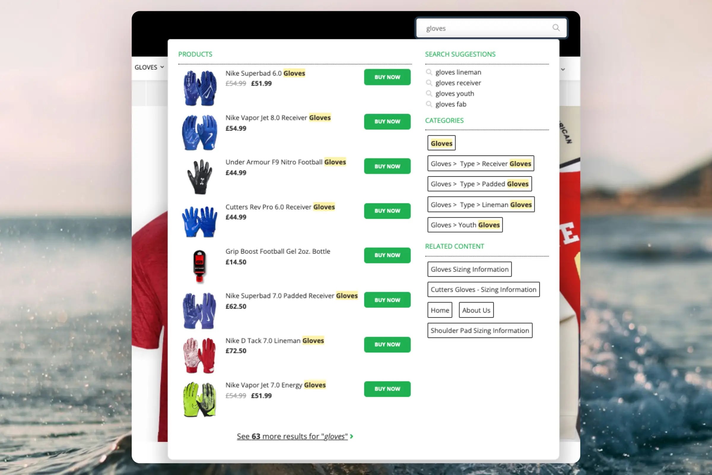
- An Instant Search Dropdown.
- A Search Page with Faceted Search filtering.
- An Omnisearch overlay that combines both.
This article explains how to get started when using the Clerk.io DanDomain Classic app.
Instant Search #
Create Design #
You can either use the Design Editor to configure it visually, or use code designs.
Design Editor #
- Go to Search > Designs and click New Design.
- Choose Other designs > Instant Search.
- From the list of design templates, choose which one you want to start with.
- Give it a name and click Create design.
- Make any changes you want to the design.
Code Design #
- Go to Search > Designs and click New Design.
- Choose Other designs > Blank > With code.
- Give it a name and click Save.
- Create a code design from scratch using Liquid code.
If you want a starting design, check the Instant Search template further down.
Create Element #
This contains all the settings used to show the Instant Search dropdown, and make it embeddable in your website.
- Go to Search > Elements.
- Click New Element.
- Name it “Live Search”.
- In Element type, select Live-search from the dropdown.
- In Design select the design you created from the dropdown.
- Click Save at the top of the screen.
Add to Website #
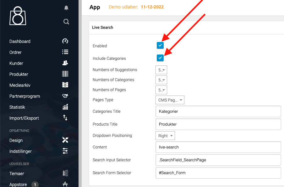
- Open the Clerk.io DanDomain Classic app.
- Enable Live-Search and Include Categories.
- Click Gem.
- Optional:
- If the dropdown is misplaced, adjust Dropdown Positioning.
- Set how many suggestions, categories, and pages to show.
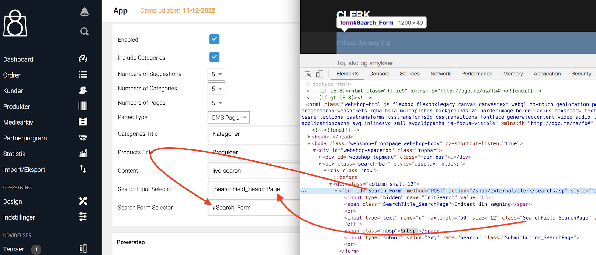
- If it doesn’t show, set Search Input Selector and Search Form Selector.
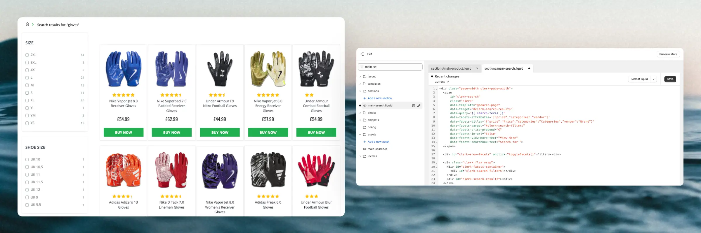
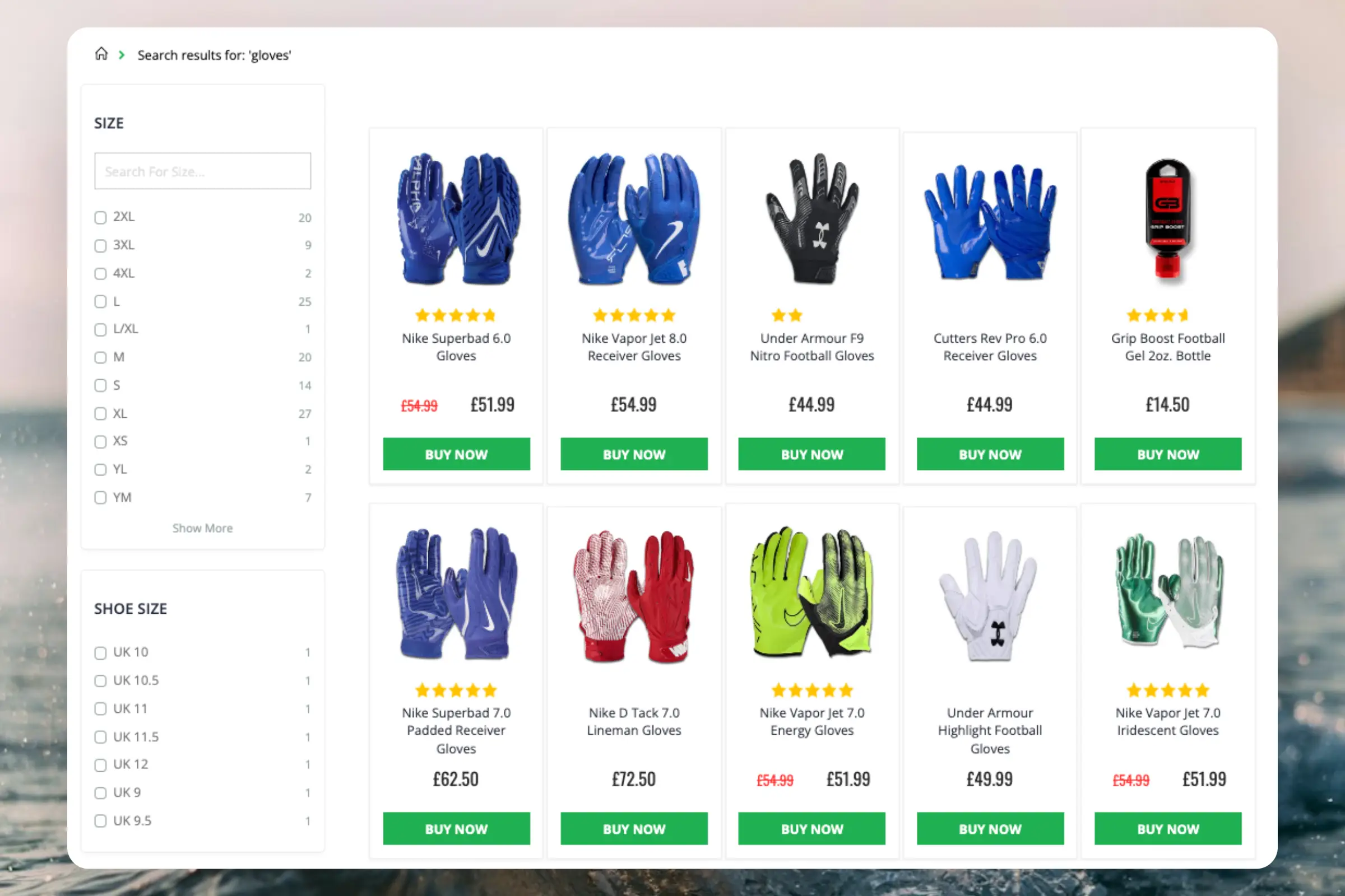
Search Page #
Create Design #
You can either use the Design Editor to configure it visually, or use code designs.
Design Editor #
- Go to Search > Designs and click New Design.
- Choose Other designs > Search Page.
- From the list of design templates, choose which one you want to start with.
- Give it a name and click Create design.
- Make any changes you want to the design.
Code Design #
- Go to Search > Designs and click New Design.
- Choose Other designs > Blank > With code.
- Give it a name and click Save.
- Create a code design from scratch using Liquid code.
If you want a starting design, check the Search Page template further down.
Create Element #
This contains all the settings used to show the Search Page, and make it embeddable into your existing search page.
- Go to Search > Elements.
- Click New Element.
- Name it “Search Page”.
- In Element type, select Search page from the dropdown.
- In Design select the design you created from the dropdown.
- Click Save at the top of the screen.
Add to Website #
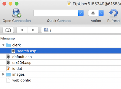
- Download the folder containing the Search Page files from your Clerk.io account. The file
search.aspinsideclerkis used for the Search Page. - Unpack it and connect to your store via FTP.
- Upload the
clerkfolder next to yourimagesfolder.
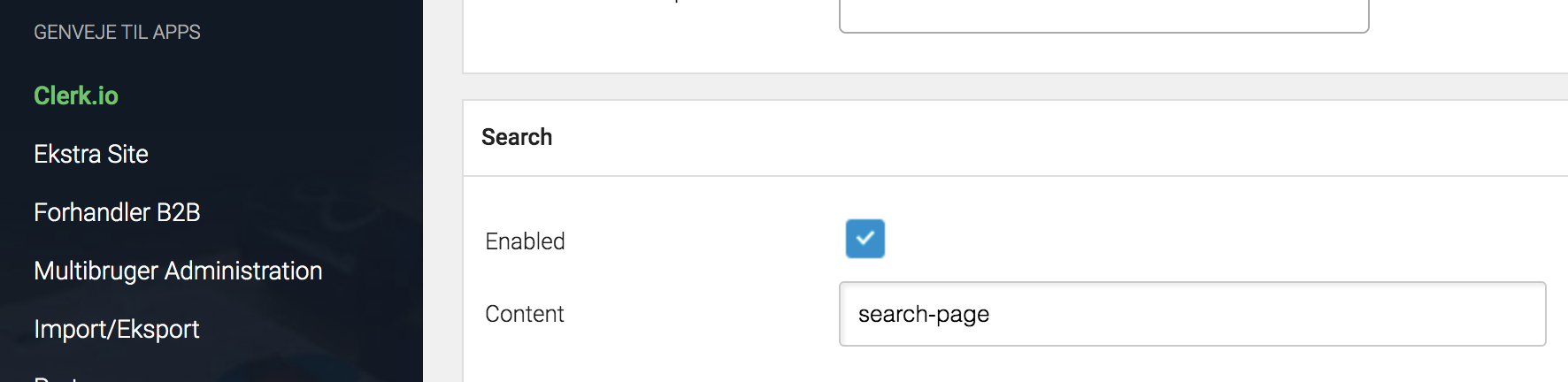
- Open the Clerk.io DanDomain Classic app.
- Enable Search and click Gem.
Omnisearch #
Create Design #
Omnisearch only works with code designs, as it has a more complex layout that can be modified in any way you want.
- Go to Search > Designs and click New Design.
- Choose Omni-search.
- From the list of design templates, choose which one you want to start with.
- Give it a name and click Save.
- Make any adjustments you want to the design. The Omnisearch guide has more information on how to do this.
Create Element #
This contains all the settings used to show the Omnisearch, and make it embeddable in your website.
- Go to Search > Elements.
- Click New Element.
- Name it “Omni-Search”.
- Add a tracking label - this should also just be “Omni-Search”.
- In Element type, select Omni-search from the dropdown.
- In Design select the design you created from the dropdown.
- Click Save at the top of the screen.
Add to Website #
Omnisearch requires manual implementation using embedded code. From the Element settings, open the Insert into website tab and use the
embedded code option. Replace INSERT_CSS_SELECTOR[...] with a unique class or ID for your search input field. Omnisearch will be shown when the input field matching the selector is clicked.
Here’s a complete Omni-search embed code example:
<span class="clerk"
  data-template="@omni-search"
  data-api="search/omni"
  data-trigger-element=".search-input">
</span>
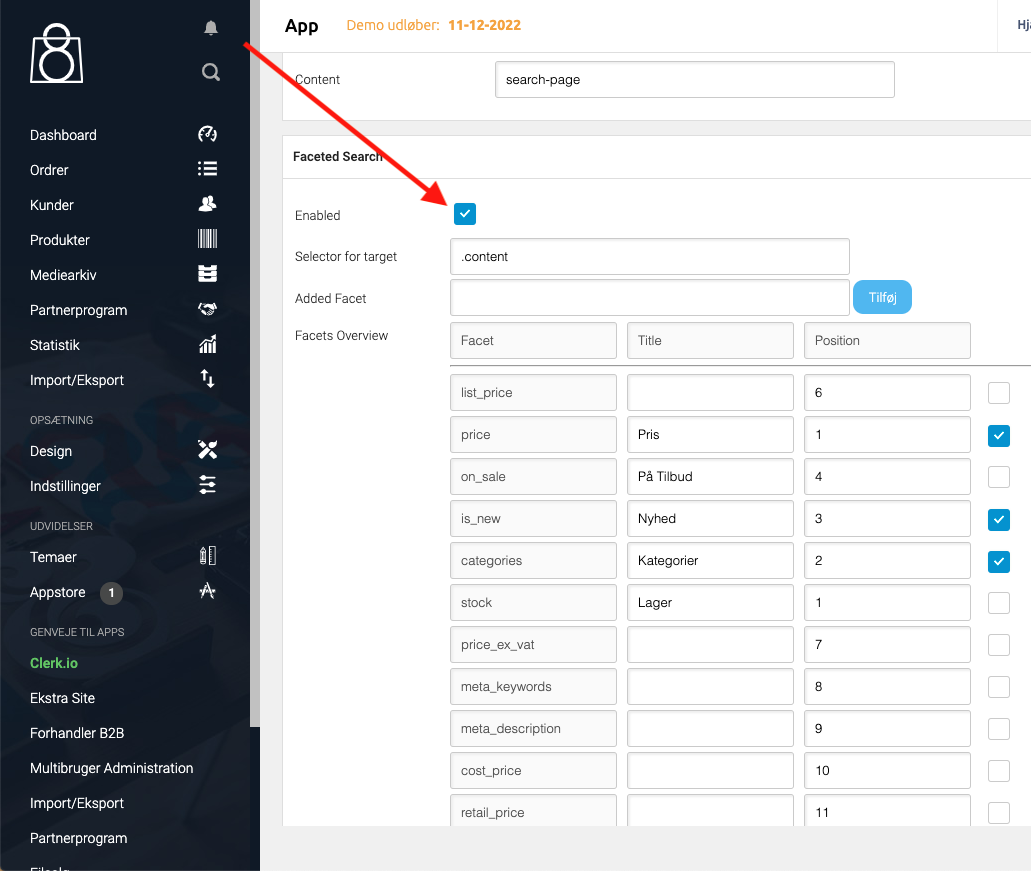
Facets #
To add filters on the Search Page, enable Faceted Search in the app. Use Added Facet to add attributes and the Facets overview to set titles, order, and visibility.
Starting Templates #
If you want to use code designs, these templates can get you started. They contain the basic UI elements that make up the Instant Search and Search Page, which you can then modify to your needs.
Instant Search Code #
This contains the HTML and CSS parts for displaying an Instant Search dropdown. Add these to a code design in my.clerk.io.
HTML #
<div class="clerk-instant-search">
    {% if hits.length == 0 %}
        <div class="clerk-instant-search-no-results">
            Nothing matched: <b>{{ query }}</b>... try a simpler search!
        </div>
    {% endif %}

    {% if content.query != response.query %}
        <div class="clerk-instant-search-alternate-query">
            <i class="fas fa-search clerk-icon" aria-hidden="true"></i> Showing results for: <b>{{ query }}</b>
        </div>
    {% endif %}

    <div class="clerk-instant-search-grid">
        {% if products.length > 0 %}
            <div class="clerk-instant-search-col clerk-col-1">
                <div class="clerk-instant-search-products">
                    <div class="clerk-instant-search-title">Products</div>
                    {% for product in products %}
                        <a href="{{ product.url }}">
                            <div class="clerk-instant-search-product clerk-instant-search-key-selectable">
                                <div class="clerk-instant-search-product-image" style="background-image: url('{{ product.image }}');"></div>

                                <div>
                                    <div class="clerk-instant-search-product-name">{{ product.name | highlight query }}</div>

                                    {% if product.price < product.list_price %}
                                        <div class="clerk-instant-search-product-list-price">{{ product.list_price | money }}</div>
                                    {% endif %}
                                    <div class="clerk-instant-search-product-price">{{ product.price | money }}</div>
                                </div>

                                <div>
                                    <div class="clerk-instant-search-product-button">Buy Now</div>
                                </div>
                            </div>
                        </a>
                    {% endfor %}

                    {% if hits > products.length %}
                        <div class="clerk-desktop-button clerk-instant-search-more-results clerk-instant-search-key-selectable">
                            <a class="clerk-view-more-results-button" href="/search?q={{ query }}">
                                <u>See <b>{{ hits }}</b> more results for "<i>{{ query }}</i>"</u>
                            </a>
                        </div>
                    {% endif %}
                </div>
            </div>
        {% endif %}

        {% if (suggestions.length + categories.length + pages.length) > 0 %}
            <div class="clerk-instant-search-col clerk-col-2">
                {% if suggestions.length > 1 %}
                    <div class="clerk-instant-search-suggestions">
                        <div class="clerk-instant-search-title">Search Suggestions</div>
                        {% for suggestion in suggestions %}
                            {% if suggestion != query %}
                                <div class="clerk-instant-search-suggestion clerk-instant-search-key-selectable">
                                    <a href="/search?q={{ suggestion highlight query 'bold' true }}">
                                    <i class="fas fa-search clerk-icon" aria-hidden="true"></i>{{ suggestion }}
                                    </a>
                                </div>
                            {% endif %}
                        {% endfor %}
                    </div>
                {% endif %}

                {% if categories.length > 0 %}
                    <div class="clerk-instant-search-categories">
                        <div class="clerk-instant-search-title">Categories</div>
                        {% for category in categories %}
                            <div class="clerk-instant-search-category clerk-instant-search-key-selectable">
                                <a href="{{ category.url }}">
                                    {{ category.name | highlight query }}
                                </a>
                            </div>
                        {% endfor %}
                    </div>
                {% endif %}

                {% if pages.length > 0 %}
                    <div class="clerk-instant-search-pages">
                        <div class="clerk-instant-search-title">Related Content</div>
                        {% for page in pages %}
                            <div class="clerk-instant-search-category clerk-instant-search-key-selectable">
                                <a href="{{ page.url }}">
                                    <div class="name">{{ page.title | highlight query 'bold' true }}</div>
                                </a>
                            </div>
                        {% endfor %}
                    </div>
                {% endif %}
            </div>
        {% endif %}
         {% if hits > products.length %}
            <div class="clerk-mobile-button clerk-instant-search-more-results clerk-instant-search-key-selectable">
                <a href="/search?q={{ query }}">
                    See <b>{{ hits }}</b> more results for "<i>{{ query }}</i>"
                </a>
            </div>
        {% endif %}
    </div>
</div>
CSS #
.clerk-instant-search {
    padding: 20px;
}

.clerk-instant-search-container a {
    color: black !important;
    text-decoration: none !important;
}

.clerk-instant-search-container a:hover {
    color: #b6c254; !important;
}

.clerk-instant-search {
    overflow: hidden;

    width: 100%;
    min-width: 650px;
    max-width: 1000px;

    margin: .2em auto;

    background-color: white;

    border: 1px solid #eee;
    border-top: 0px;

    border-radius: 5px 5px 10px 10px;

    box-shadow: 0 1em 2em 1em rgba(0,0,0,.2);
}

.clerk-instant-search-no-results {
    padding: 1em;

    font-style: italic;

    text-align: center;
}

.clerk-instant-search-alternate-query {
    margin: 0px 0px 5px 0px;
}

.clerk-instant-search-more-results {
    padding: 1em;

    font-size: 1.2em;

    text-align: center;
}

.clerk-instant-search-title {
    color: #b6c254;
    margin: 20px 0px 5px 0px;
    padding: 0px 0px 10px 0px;
    text-transform: uppercase;
    font-size: 1em;
    border-bottom: 1px solid #000000;
}


/* Products */
.clerk-instant-search-products {
    padding-right: 2em;
}

.clerk-instant-search-product {
    display: flex;

    padding: .2em;

    color: gray;
}

.clerk-instant-search-product:hover {
    background-color: rgba(46, 204, 113, .1);
}

.clerk-instant-search-product:hover .clerk-instant-search-product-button {
    transform: scale(1.05);
}

.clerk-instant-search-product > * {
    flex: 1 1 auto;
}
.clerk-instant-search-product > *:first-child, .clerk-instant-search-product > *:last-child {
    flex: 0 0 auto;
}

.clerk-instant-search-product-image {
    display: inline-block;

    width: 3em;
    height: 3em;

    margin-right: 1em;

    background-position: center center;
    background-repeat: no-repeat;
    background-size: contain;
}

.clerk-instant-search-product-name {
    overflow: hidden;

    height: 1.2em;

    margin-bottom: .2em;
}

.clerk-instant-search-product-list-price {
    display: inline-block;

    margin-right: .5em;

    opacity: .8;

    font-weight: normal;
    text-decoration: line-through;
    color: gray;
}

.clerk-instant-search-product-price {
    display: inline-block;

    font-weight: bold;
}

.clerk-instant-search-product-button {
    display: block;

    margin: .2em auto;
    padding: .8em 2em;

    border: none;
    border-radius: .5em;

    background-color: #b6c254;
    color: white;

    text-transform: uppercase;
    text-align: center;

    white-space: nowrap;

    font-weight: bold;
    font-size: .8em;

    cursor: pointer;
}

/* Suggestions */

.clerk-icon {
    color: lightgray;
    margin-right: .5em;
}

.clerk-instant-search-suggestions {
    margin-bottom: 1em;
}

.clerk-instant-search-suggestion {
    padding: .1em;
}


/* Categories */
.clerk-instant-search-categories {
    margin-bottom: 1em;
}

.clerk-instant-search-category {
    padding: 5px;
    margin: 5px;
    width: auto;
    display: inline-block;
    border: 1px solid black;
    border-radius: 2px;
}


/* Pages */
.clerk-instant-search-pages {
    margin-bottom: 1em;
}

.clerk-instant-search-page {
    padding: .1em;
}

@media screen and (min-width: 1200px) {
    .clerk-instant-search-container {
        width: 50%;
    }
    .clerk-instant-search-grid {
        display: flex;
    }

    .clerk-col-1 {
        flex: 2;
    }

    .clerk-col-2 {
        flex: 1;
    }

    .clerk-mobile-button {
        display: none;
    }
}

@media screen and (min-width: 768px) and (max-width: 1200px){
    .clerk-instant-search-container {
        right: 0px !important;
        left: 0px !important;
    }
    .clerk-mobile-button {
        display: none;
    }
}

@media screen and (max-width: 767px) {
    .clerk-instant-search-container {
        right: 0px !important;
    }
    .clerk-desktop-button {
        display: none;
    }
}

@media screen and (min-width: 376px) and (max-width: 800px) {
    .clerk-instant-search {
            min-width: 0px !important;
    }
}

@media screen and (max-width: 375px) {
    .clerk-instant-search {
        min-width: 200px !important;
    }
    .clerk-instant-search-col {
        margin: 0px 0px 20px 0px;
    }
    .clerk-instant-search-product-name {
        height: 3em !important;
    }
}
Search Page Code #
This contains the HTML and CSS parts for displaying a Search Page. Add these to a code design in my.clerk.io.
HTML #
<div class="clerk-search-result">
<div class="clerk-search-result-headline">{{ headline }}</div>
<div class="clerk-grid">
{% for product in products %}
<div class="clerk-grid-item">
<div class="clerk-grid-product">
<a href="{{ product.url }}">
{% if product.price < product.list_price %}
<div class="clerk-grid-badge">On Sale</div>
{% endif %}
<div class="clerk-grid-image" style="background-image: url('{{ product.image }}');"></div>
<div class="clerk-grid-brand">{{ product.brand }}</div>
<div class="clerk-grid-name">{{ product.name }}</div>
<div class="clerk-grid-pricing">
{% if product.price < product.retail_price %}
<div class="clerk-grid-list-price">£{{ product.retail_price | money }}</div>
{% endif %}
<div class="clerk-grid-price">£{{ product.price | money }}</div>
</div>
</a>
{% if product.stock == 1 %}
<a class="clerk-not-in-stock" href="{{ product.url }}" data-event-type="product-click">
<div class="clerk-grid-button-not-in-stock">Out of Stock</div>
</a>
{% else %}
<a class="clerk-add-to-cart" href="/cart.php?action=add&product_id={{ product.id }}" data-event-type="product-click">
<div class="clerk-grid-button">Add to Cart</div>
</a>
{% endif %}
</div>
</div>
{% endfor %}
</div>
{% if count > products.length %}
<div class="clerk-load-more-button" onclick="Clerk('content', '#{{ content.id }}', 'more', 40);">Show More Results</div>
{% endif %}
</div>
CSS #
#clerk-search-results {
    margin: 0px;
}

.clerk-search-result {
    margin: 1em 0;
}

.clerk-search-result-headline {
    font-weight: bold;
    font-size: 2em;

    text-align: center;
}

.clerk-grid {
    display: flex;
    flex-flow: row wrap;
}

.clerk-grid-item {
    margin: auto;
}

.clerk-grid-product {
    position: relative;
    overflow: hidden;

    margin: 1em;
    padding: 1em;

    background-color: white;

    border: 1px solid #eee;
    border-radius: 1em;

    box-shadow: 0 .1em .2em 0 rgba(0,0,0,.08);

    text-align: center;
}

.clerk-grid-badge {
    position: absolute;
    top: 5px;
    right: -35px;

    display: inline-block;

    width: 120px;

    margin: 10px auto;
    padding: 5px 0;

    border-radius: 3px;

    background-color: #fbc531;

    font-size: 10px;
    color: white;

    text-align: center;
    letter-spacing: 1px;

    transform: rotate(45deg);
}

.clerk-grid-tags {
    position: absolute;
    top: .8em;
    left: .8em;
}

.clerk-grid-tag {
    display: inline-block;

    padding: .2em .8em;

    border-radius: .3em;

    background-color: gray;

    font-size: 10px;
    color: white;

    letter-spacing: 1px;
}

.clerk-grid-image {
    width: 100%;
    height: 8em;

    margin-bottom: 1em;

    background-position: center center;
    background-repeat: no-repeat;
    background-size: contain;
}

.clerk-grid-brand {
    font-size: 0.9em;
    color: #757575;;
}

.clerk-grid-name {
    height: 3em;
    overflow: hidden;
    color: #4a3b40;
    font-weight:bold;
    font-size: 15px;
    margin-bottom: 1em;
}

.clerk-grid-pricing {
    display: flex;

    margin-bottom: 1em;
}

.clerk-grid-price {
    flex: 1;
    color: #757575;
    font-weight: bold;
}

.clerk-grid-list-price {
    flex: 1;

    opacity: .8;

    font-weight: normal;
    text-decoration: line-through;
    color: gray;
}

.clerk-add-to-cart, .clerk-add-to-cart:hover {
    color: white;
}

.clerk-not-in-stock, .clerk-not-in-stock:hover {
    color: #4a3b40;
}

.clerk-grid-button-not-in-stock {
    display: block;

    margin: 0 auto;
    padding: .6em 2em;

    border: none;
    border-radius: .5em;

    background-color: white;
    color: #4a3b40;

    text-transform: uppercase;
    text-align: center;

    white-space: nowrap;

    font-weight: bold;

    cursor: pointer;
}

.clerk-grid-button {
    display: block;

    margin: 0 auto;
    padding: .6em 2em;

    border: none;
    border-radius: .5em;

    background-color: #b6c254;
    color: white;

    text-transform: uppercase;
    text-align: center;

    white-space: nowrap;

    font-weight: bold;

    cursor: pointer;
}


.clerk-load-more-button {
    display: block;

    width: 20em;

    margin: 1em auto;
    padding: .6em 2em;

    border: none;
    border-radius: .5em;

    background-color: #b6c254;
    color: white;

    text-transform: uppercase;
    text-align: center;

    white-space: nowrap;

    font-weight: bold;
    font-size: 1.2em;

    cursor: pointer;
}

@media screen and (min-width: 1025px) {
    .clerk-grid-item {
        flex: 0 0 25%;
        margin: auto;
    }
}

@media screen and (min-width: 500px) and (max-width: 1024px) {
    .clerk-grid-item {
        flex: 0 0 33%;
        margin: auto;
    }
}

@media screen and (max-width: 499px) {
    .clerk-grid-item {
        flex: 0 0 100%;
        margin: auto;
    }
}