Menu & Navigation improvements
Products:
We are excited to announce a series of improvements in my.clerk.io:
NAVIGATION IMPROVEMENTS:
We have modified our store lateral menu in order to provide you with a better access to all the tools and resources that my.clerk.io has to offer.
You will notice some general changes in the structure:
- There is a better organisation of the different sections in my.clerk, with a more clear division of sections by group.
- Now, you can explore subsections under a navigational item without being forced to navigate there.
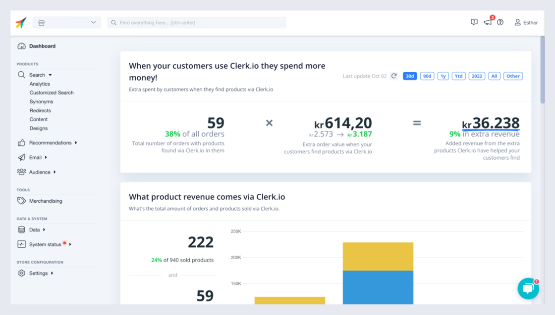
- Product insights are now hosted in dedicated analytics pages.
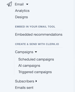
Also, if you are a user of our Email product, you will find some differences under the Email section:
- The content under “Email” is now distributed into subsections. In first place you can see the general tools (Analytics and Designs). Right after, you will find the different toolkits to either embed recommendations in your email marketing platform, or create and send emails directly with Clerk.io.
- Campaigns, newsletters and triggers have been renamed into Scheduled, AI and Triggered Campaigns, and are now hosted under the “Campaigns” section.
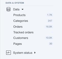
We have divided the information under Data into two different sections (Data and System status), in order to help you find what you’re looking for much faster and in a more intuitive way:
- All your store’s Data (products, categories, orders, etc.), is still hosted under Data. And, all the resources to assess and mange the System status, is now hosted under the section with the same name.
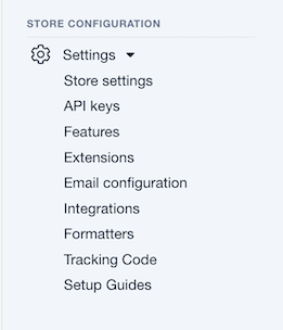
Finally, under Settings, you will find all the tools and resources to configure your store, your products and the available features for them.
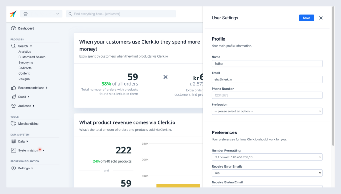
When it comes to our top navigation bar, we have modified the profile section.
It is still accessible by clicking the user icon, but it is now displayed as an overlay, making it easier to navigate out of it.
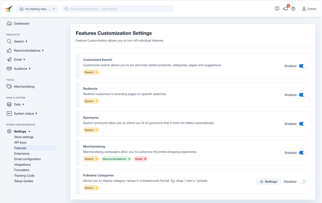
BRUSH UP IN FEATURES PAGE:
Along with those navigational changes, we release the redesign of the Features page.
The new layout provides more visibility on the status of the different features, and the products related to it.
We hope you enjoy these improvements 😊