Design Editor
Basics #
When you are working with Content to add Clerk.io elements to your site, the Design Editor can be used to control the look and feel of the elements.
You can create any number of designs that you want, and any amount of Content blocks can use the same design.
When you go to the Designs page for Search / Recommendations / Email, you can see a list of all your designs, including their IDs.
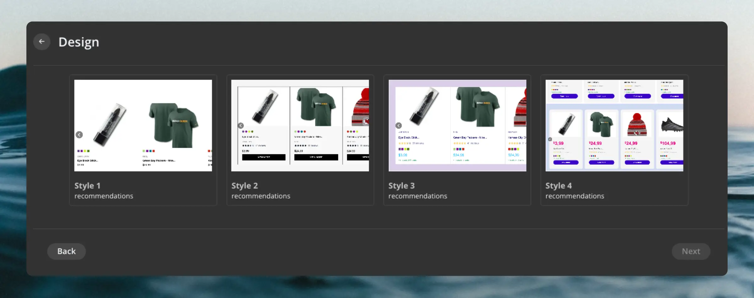
When you create a new design, you can select a starting template from our Design Library to get you started, or simply start from scratch.
Screen Sizes #
In the top right of the screen, you can preview your designs for different screen sizes. Many of the components also support individually styling for each of these screen sizes to make your designs fully responsive.
You can add styling to the following screen sizes:
- Desktop
- Tablet
- Mobile
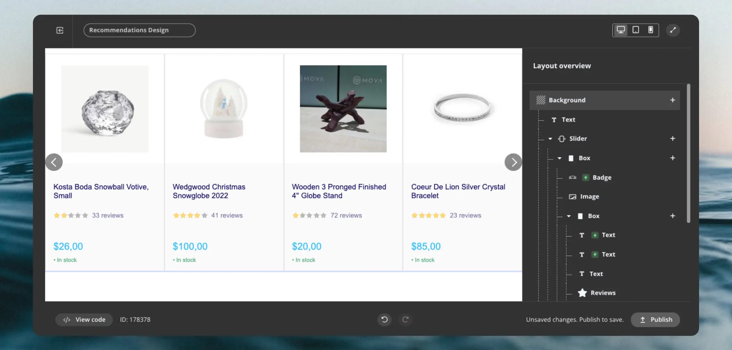
Layout Overview #
The Design Editor itself consists of:
- A preview window showing the design as it will look on your site.
- The layout overview listing all of the components that make up the design.
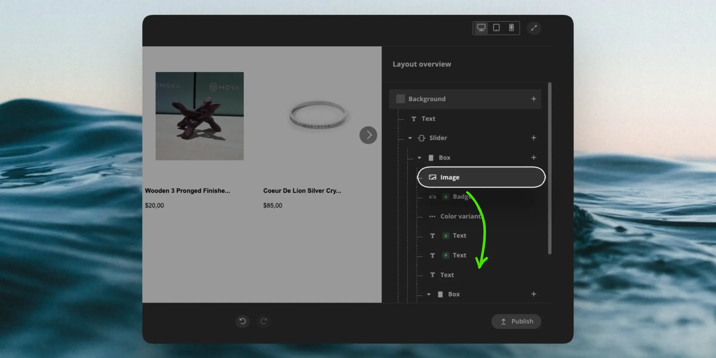
Components are generally listed in the order that they are displayed. The only exception is when you use floating components like Badges, that can be placed over other components.
Hovering over any component in the layout overview will highlight it in the preview window, so you can see what you are working with. Clicking an element in the preview window will likewise open the settings for the component that displays it.
You can drag components in the layout overview to change their position.
Components #
Each design consists of a number of building blocks, called components. A design can contain as many as you want, in any order you want.
New components are added by clicking the '+' button in the right side of either the Background component or any other one.
General settings #
In addition to their specialized settings, most components share the below standard settings as well.
Conditional Display #
This lets you show or hide the component based on whether a condition is met. It uses the syntax from our
Filters system, and always references item as the data source.
An example could be to only show a component if a product is on sale: item.on_sale == true.
Or, only show it if the price is more than 100 and the product is in stock: item.price > 100 and item.in_stock == true.
Custom CSS #
This lets you apply specific CSS rules to the component, if you need to make adjustments that the settings don’t allow otherwise.
The CSS rules you add will only influence the component you add them to.
Fonts #
The Design Editor comes bundled with a wide range of fonts you can use. In addition, you can choose to simply inherit the font from your webshop by choosing Use webshop font.
The only limitation of this is for Embedded Email Recommendations, where you need to select a font, as they do not have access to your webshop’s fonts.
Liquid variables #
In any text field, you have the option to add data through the Liquid templating language.
This includes creating dynamic text fields like {{ headline }} or adding calculations based on product attributes like: {{ 100-((item.list_price*100)/item.price) | round }} %
The above example would calculate the rounded percentage saved when a product is on sale.
Background #
This is a special component which is the base of any design. The background is the overall container that the rest of the design is inserted into.
Usually the background is transparent, but you can select a background color if needed.
Data Loop #
This allows you to loop over a type of data and show a chosen amount of them. This can be used for displaying products, categories or pages, or loop through an attribute like variants or colors.
You can set an index if you want to start from a certain item in the list other than the first, and you can choose the amount of items to show.
This component will show items in a column by default.
Grid of items #
Works just like the Data Loop , but shows items in a grid layout rather than a single column. This is useful for creating a Search Page or Category Page design with products shown next to each other.
You can configure the amount of columns based on screen size, and the spacing between the items both horizontally and vertically.
Slider #
Shows items in a horizontal row with slider arrows to scroll through them.
You can configure the amount of items to show for each slide based on screen size, and the default styling for the buttons. Currently there are 4 button types:
- Default
- Yellow
- Bordered
- No background (if you want to customize arrows with CSS)
Use Button position to choose whether buttons should be centered on either side of the slider, or shown in any of its 4 corners.
Load more button #
Mainly used for Search Page and Category Page designs, this button allows users to see more items than the default amount you have configured.
This is good practice as it allows you to reduce load times by showing a smaller amount of items initially, and letting users see more if they want to.
The button can be configured with a custom text and the amount of items to load each time it’s clicked. It will load as many items as the chosen Product Logic returns until no more items are found.
Box #
These work as containers for other components. They can be used to group components together, or to create a layout with multiple columns.
They can be configured with a background color and a layout which is based on the flexbox CSS layout system.
You can also control the dimensions of the box as well as margin and padding.
Line #
A simple divider line used to separate components visually.
You can control its color and style like whether it should be solid, dotted, dashed or doubled.
Badge #
This is a great way to add visual style to your design, and it’s especially useful for promoting details about your products like discounts, news and more.
Badges have a range of settings to control the style, position, text to display and more. They can be shown in either of the 4 corners of an element and be shown either as a rounded box or a diagonal banner.
Button #
A simple button that can function as an effective call-to-action for visitors. It allows you to configure the text to display, a custom link or onclick event to use when it’s clicked, and the background color so it matches your brand.
The onclick event is a piece of Javascript that should run when the button is clicked, which can be used for add-to-cart functions, wishlist features and other Javascript functionality.
Image #
A visual component that shows an image in a specified size based on an attribute (like a product image) or a specific URL.
You can add a unique link to the image if you e.g. want to send customers to the product page when it’s clicked and you can choose a hover-over effect like making the image larger when visitors hover their mouse over it.
Link #
Configure a URL to send visitors to when any component inside of it is clicked.
You can choose the value of an attribute (like a product URL), a specific URL or an onclick event.
Price #
Most often used to display the price of a product, this component contains a number of price-specific configuration settings.
These include the amount of decimals, the thousands- and decimal-separators and the currency symbol to be displayed either before or after the price.
Text #
Adds text blocks to your design. These are used for many different purposes, like showing the names of products or pages, brands, descriptions and any other data you want to represent as text.
Text can be based on static text of your choice or attribute data like product names or page titles. You can also style text with classic formatting options like bold, italic and more.
Color variants #
This is a specialized
Data Loop that allows you to loop over a list of colors codes and show them as color options. They work best if you send a list of color codes for each product. E.g. color_codes = ['#FFA07A', '#008080', '#4CAF50', '#FFD700']
Reviews #
Adds review stars to your design, indicating how much buyers liked the product. Reviews are shown as 5 stars, with the average rating shown as black-colored stars.
Further, it displays the number of reviews that the products has received next to the stars.
They require the following two attributes to be available for products:
reviews_avg: The average rating for the product out of 5 stars.reviews_amount: The total number of reviews for the product.
Custom HTML #
This is a specialized component that allows you to add any HTML code to your design. This can be used for adding custom scripts, or for adding any specialized blocks that would otherwise be difficult to create with the other components.
They also support using Liquid variables, to access and work with data objects like products, categories and pages.
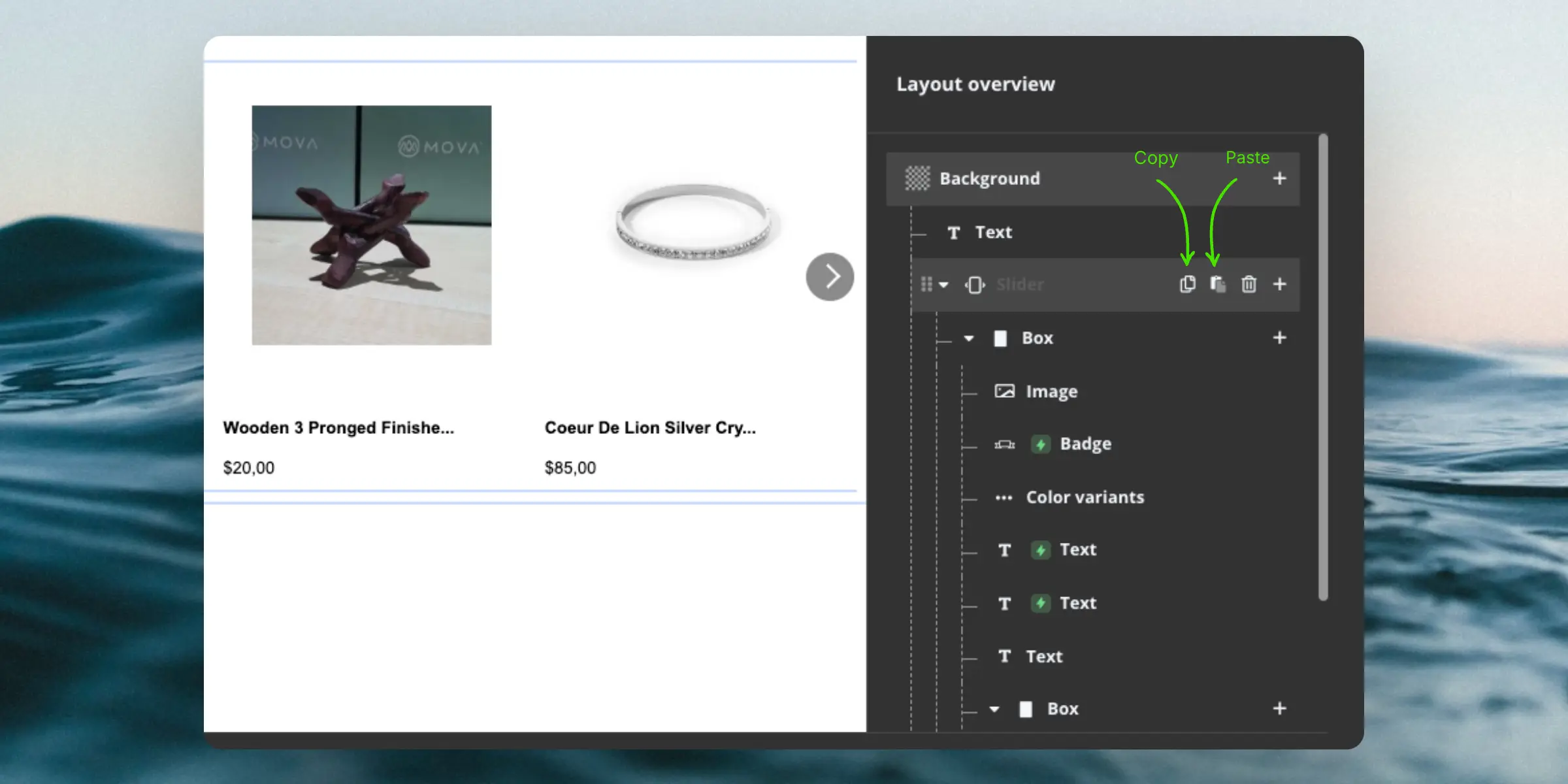
Copying Components #
If you want to reuse components from a different design, you can copy them between designs. This works both between different designs on a single Store, but you can also copy components between Stores on your account.
Simply hover over a component in your source design and click the Copy button. Go to your target design and click the Paste button to add within the component where it should be shown.
Viewing Code #
At any time, you can inspect the generated code for your design by clicking the View code button. This will show you the generated HTML and CSS respectively.
You can use this to convert your Design Editor design into a Code Design, by copying the HTML and CSS, creating a new empty Code Design, and adding the HTML and CSS to it.
Undo / Redo #
If you make a mistake, you can always undo your latest actions by clicking the Undo button or add it back with the Redo button. Both are found just under the preview window.
Publishing #
When you are ready to use your design, it must be published by clicking the Publish button. After making changes, you should also publish your design again.
You can then choose to either exit the Design Editor, or stay and make additional changes.