Sliders
Basics #
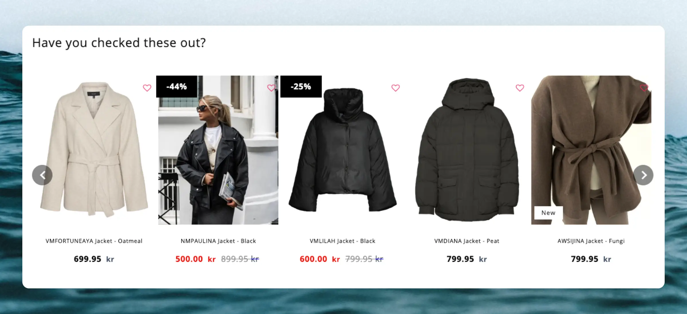
Clerk.js comes with a built-in function for showing products with sliders. This feature shows a row of products with a set of arrows, that lets customers navigate many products with just a few clicks.
It basically works by creating a long, horizontal list of products, and then showing a fixed “window” of products at a time, which is controlled with the buttons.
The slider functionality is coded to show an entire new row of products for each click, to show as many new products as possible with as few clicks as possible.
Design Editor #
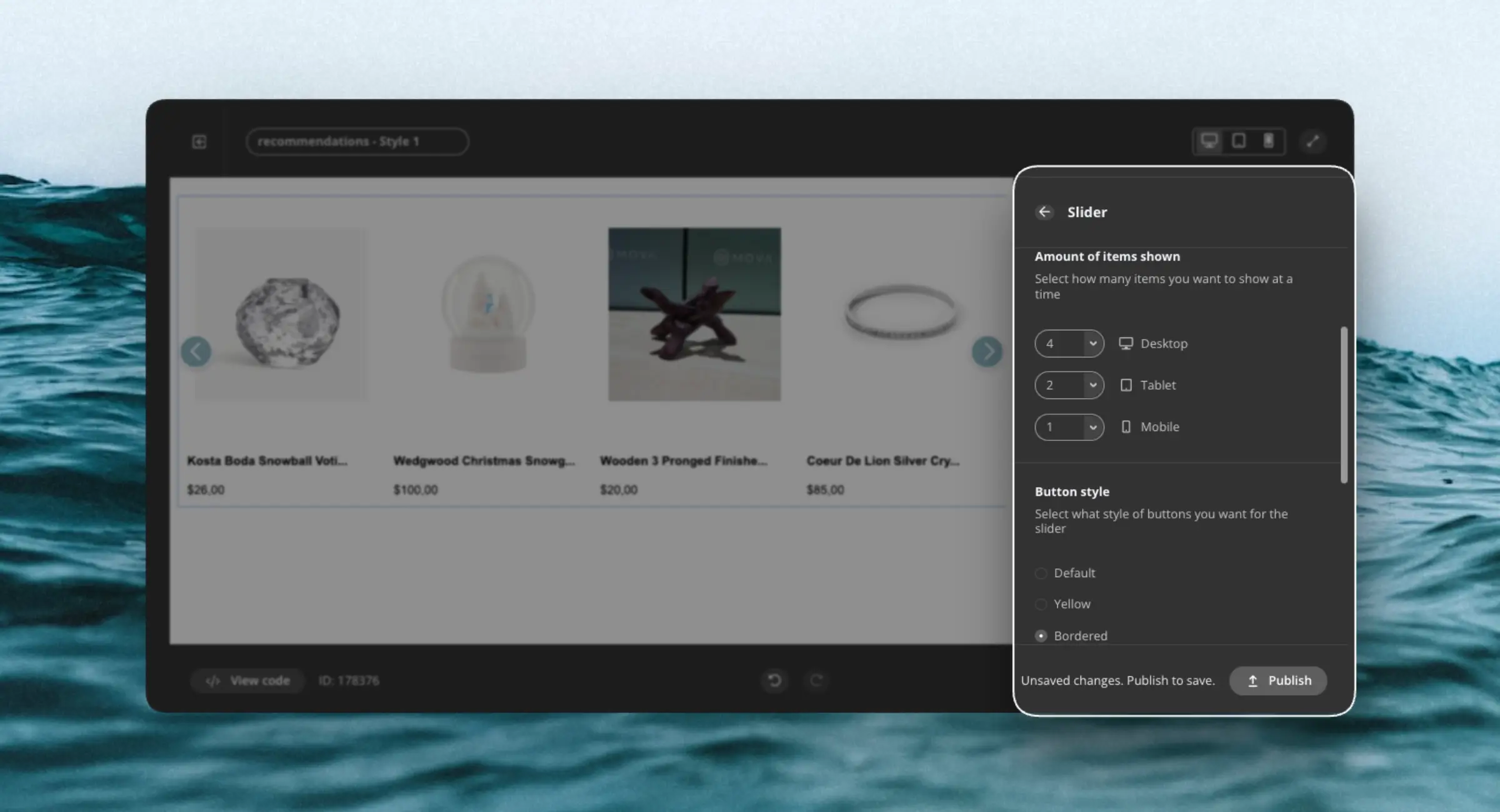
When creating designs with the Design Editor, the template designs come with the slider component pre-selected.
The Slider component comes with a number of options to let you customize its appearance:
- Amount of items to show by screen size
- Several button styles
- Position of the arrows
Code Designs #
For
code designs, adding the class clerk-slider in the container, will display the design as a slider:
<ul class="product-list clerk-slider">
    {% for product in products %}
      <li class="product">
        <h2 class="product-name">{{ product.name }}</h2>

        <img src="{{ product.image }}" title="{{ product.name }}" />

        <div class="price">${{ product.price | money }}</div>
        <a href="{{ product.url }}">Buy Now</a>
      </li>
    {% endfor %}
  </ul>
Standard designs #
The standard design for Sliders includes:
- Variants dropdown support: Let shoppers choose variant attributes (e.g. size, color) before adding to cart.
- Quantity selector.
- Native Add-to-Cart button that notifies Clerk.js, ensuring analytics and merchandising stay in sync.
- Clean, well-structured markup with clear comments.
- Centralized variables for styling and behavior, making it easy to adjust colors, spacing, labels, and common options without changing core code.
Custom slider-arrows #
If you want to use your own slider-arrows, or want to change their placement, you can add CSS to the below classes.
The new styling can be added as part of the Design in my.clerk.io. or simply in your existing stylesheet.
<style type="text/css">
    @keyframes arrowPop {
        0% {
            width: 20%;
        }
        50% {
            width: 0%;
        }
        100% {
            width: 20%;
        }
    }

    .clerk-slider-nav {
        background: #333;
        border-radius:50%;
        display:flex;
        justify-content:center;
        align-items:center;
        font-size:0;
        opacity:0.8;
        filter: drop-shadow(0 0 5px #333);
        transition:0.3s ease;
    }

    .clerk-slider-nav:hover {
        opacity:1;
        transition:0.3s ease;
    }
    .clerk-slider-nav:hover:before {
        animation:arrowPop 0.3s ease;
    }
    .clerk-slider-nav-next {
        flex-direction:row-reverse;
    }

    .clerk-slider-nav:after {
        content:"";
        display:block;
        height:40%;
        width:40%;
        transform: rotate(45deg);
        border: solid white;
    }
    .clerk-slider-nav-prev:after {
        border-width: 0px 0px 2px 2px;
    }

    .clerk-slider-nav-next:after {
        border-width: 2px 2px 0px 0px;
    }

    .clerk-slider-nav:before {
        content:"";
        width:20%;
    }
</style>